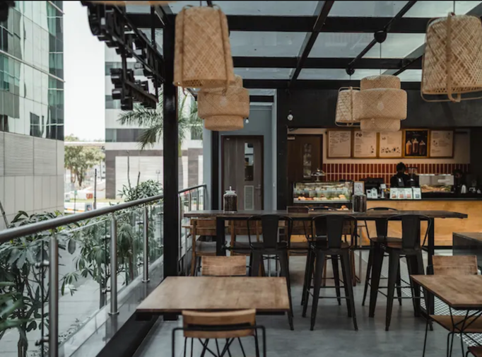
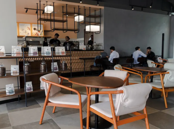
Third Wave Coffee
Third Wave Coffee Roasters was born out of the dream to introduce India to the ‘Third Wave movement’- with a dedication to provide high-quality coffee.
ROLE
User Experience, User Interface
Alchemy Technologies Client
Project Vision
Third Wave Coffee's primary objective is to create a "customer-first approach" and become the preferred coffee partner across India. Their customers are the number one priority and should be rewarded and incentivized for brand commitment.
Project Goals
- Create a seamless and flexible design for the rewards program
- Design for customer delight and customer loyalty
- Create solid building blocks around feature development
- Promote the benefits of coffee subscription packs
Hey there, this is the default text for a new paragraph. Feel free to edit this paragraph by clicking on the yellow edit icon. After you are done just click on the yellow checkmark button on the top right. Have Fun!
Third Wave Values
- Attention to detail - The taste of a full-bodied flavour but balanced coffee is what they strive to achieve.
- Fairtrade - Third Wave Coffee works with farmers to select the highest quality coffee and for farmers to be a part of their story.
- Commitment to quality roasting methods - They reduce harmful gas emissions by half compared to other roasters.
- Ethical pricing - They care about customers being able to enjoy an exceptional coffee experience.
Kickoff
Title
To start, I asked myself a couple of initial questions.
- Who will be the primary user?
- What are their goals?
- Why would they use this app?
After taking the time to investigate, it became apparent that the goals they wanted to achieve all fell within similar categories: getting more bang for their buck and collecting their order quickly.

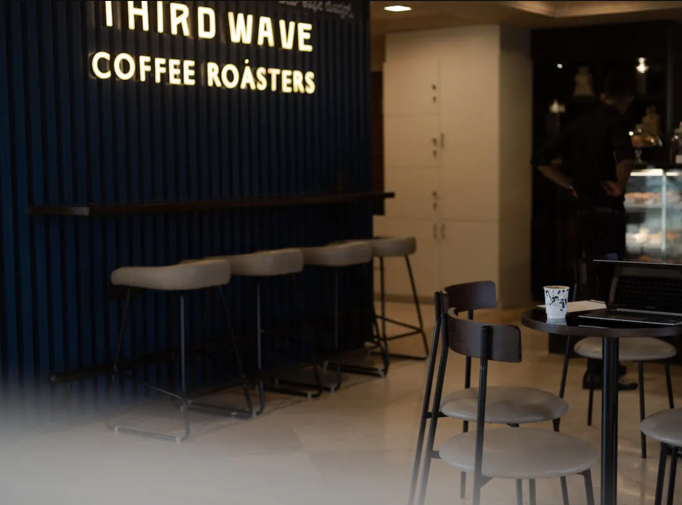
Competitive Analysis: Starbucks
To construct a concise foundation for Third Wave, I researched how Starbucks, one of the largest competitors, operates its app. As of 2019, India has 140 different Starbucks locations within ten different cities. Starbucks has become the go-to coffee shop for most because of this reason. Starbucks heavily relies on its brand image and convenience with multiple stores all over the country, even when only serving 'average' coffee quality.
STRENGTHS
- Strong brand image
- Loyalty program
- Mobile ordering
- User-friendly design
WEAKNESSES
- High prices
- Coffee quality does not meet price standards
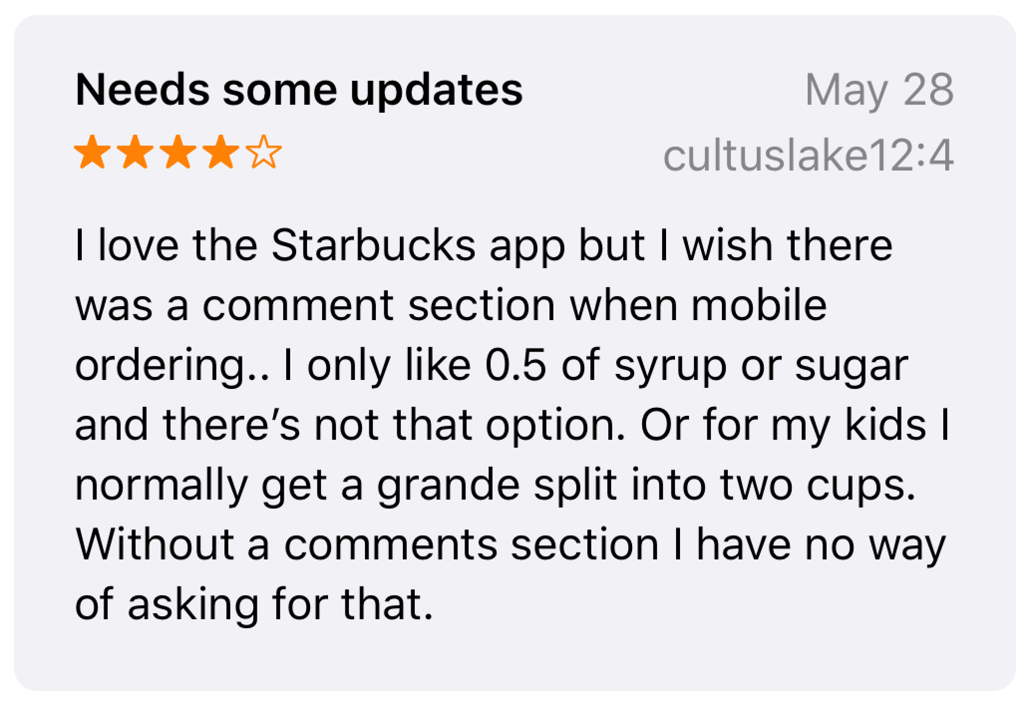
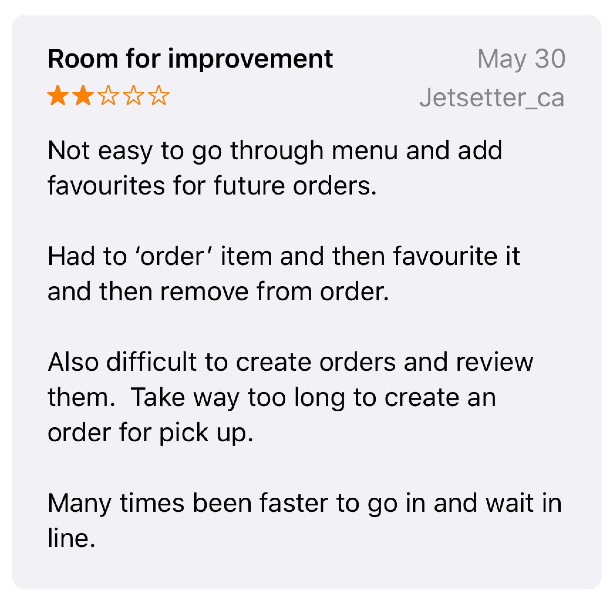
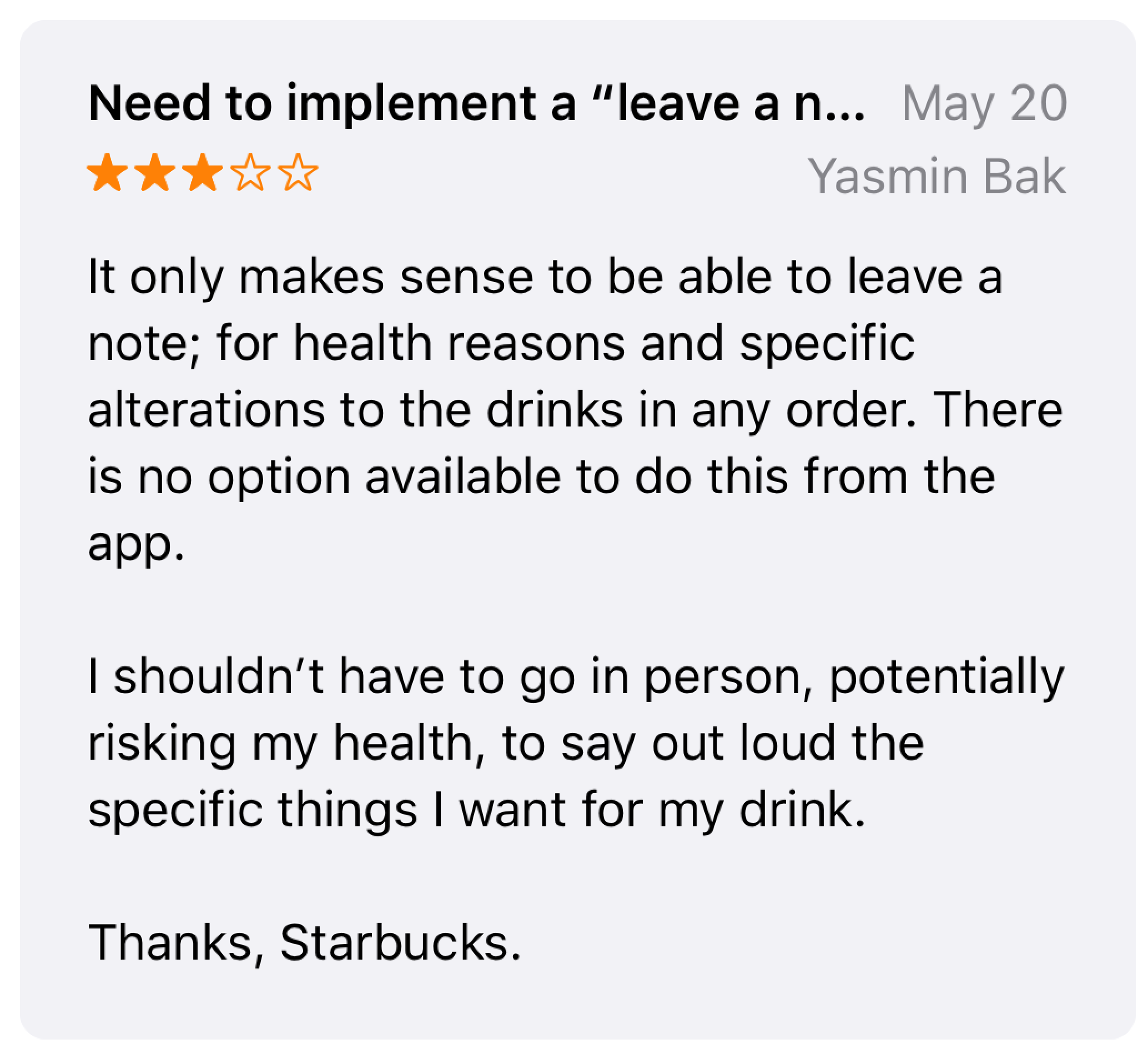
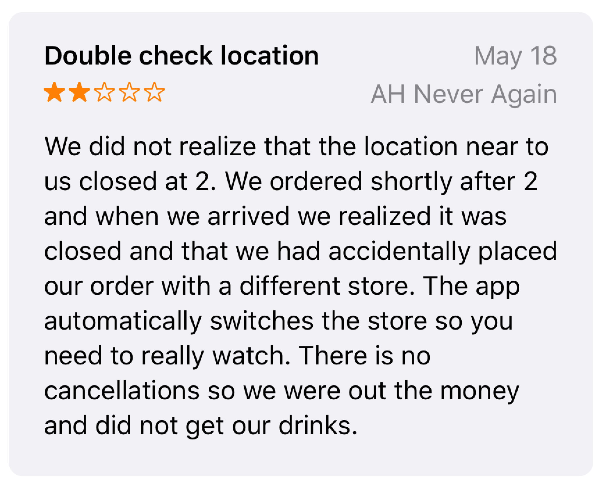
I took a look at some of the more unsatisfactory reviews on the App Store for Starbucks, and here's what particularly stood out for me.
- Additional comments section when ordering - some customers have health and other concerns that baristas may need to know.
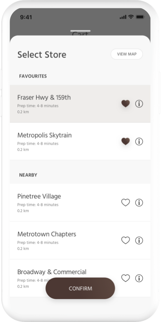
- Store selection confirmation - speaking from personal experience, I have accidentally ordered from the wrong store about five times since I've installed the app.
- "At-home" coffee products should show more information - customers should know the number of grams.
- Adding an item to favourites - customers should be able to add favourites without adding an item to the cart.
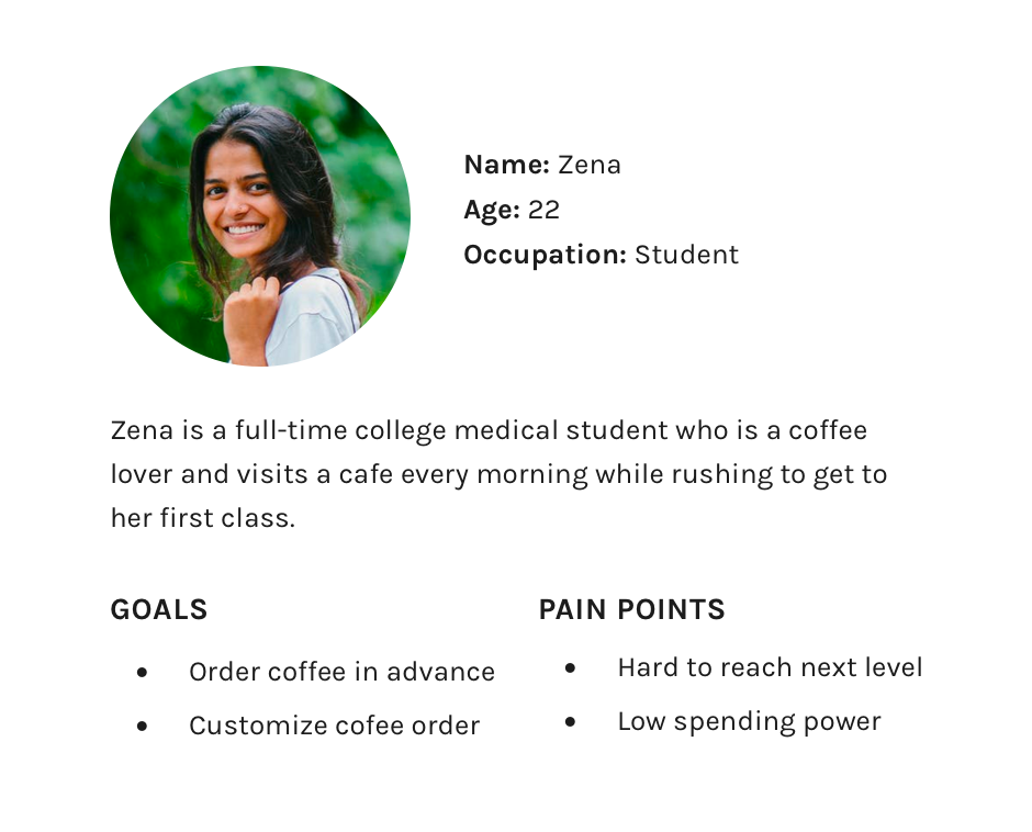
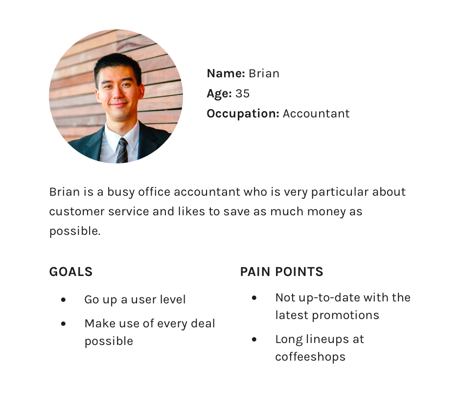
Meet the Users
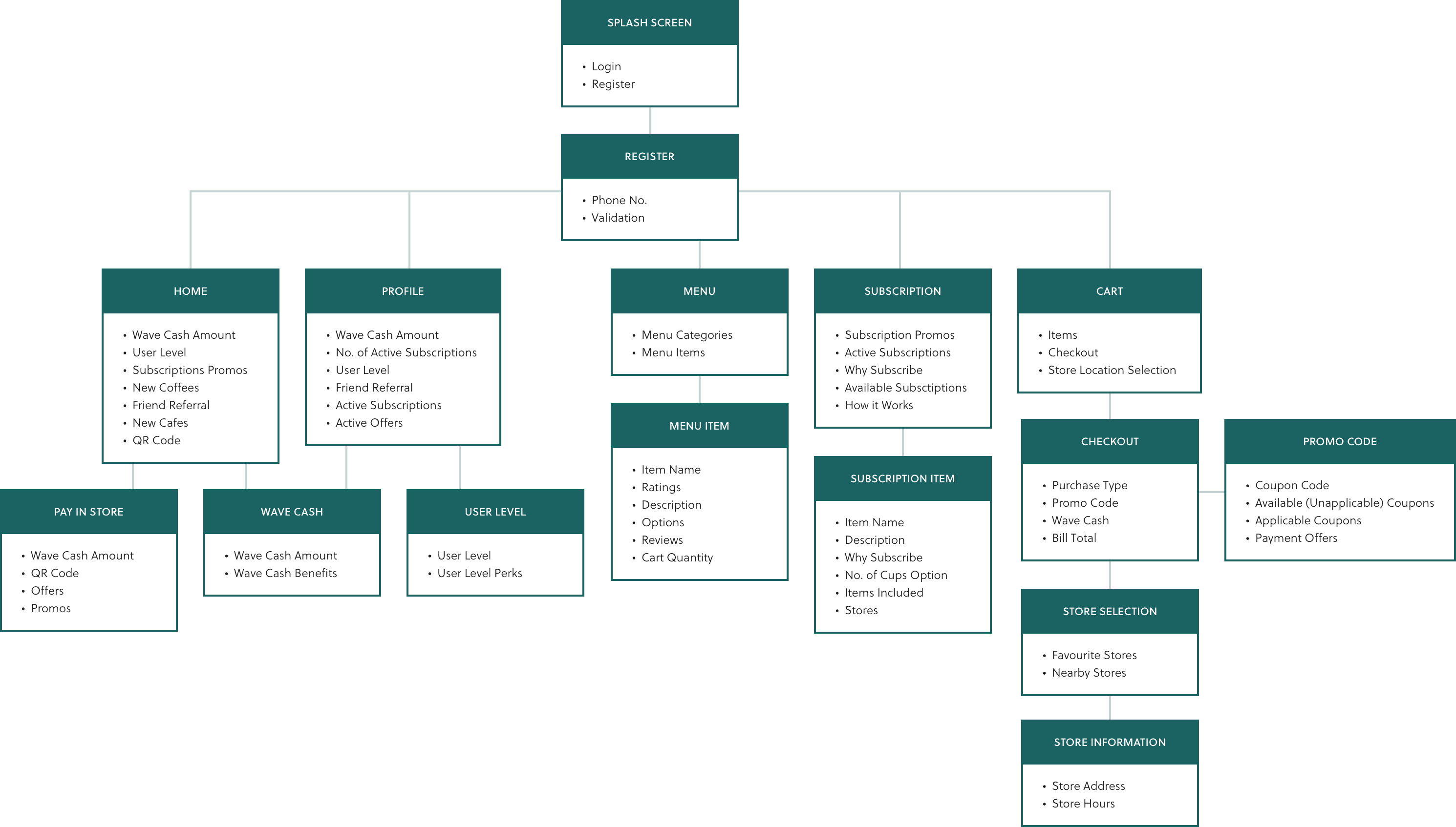
Information Architecture
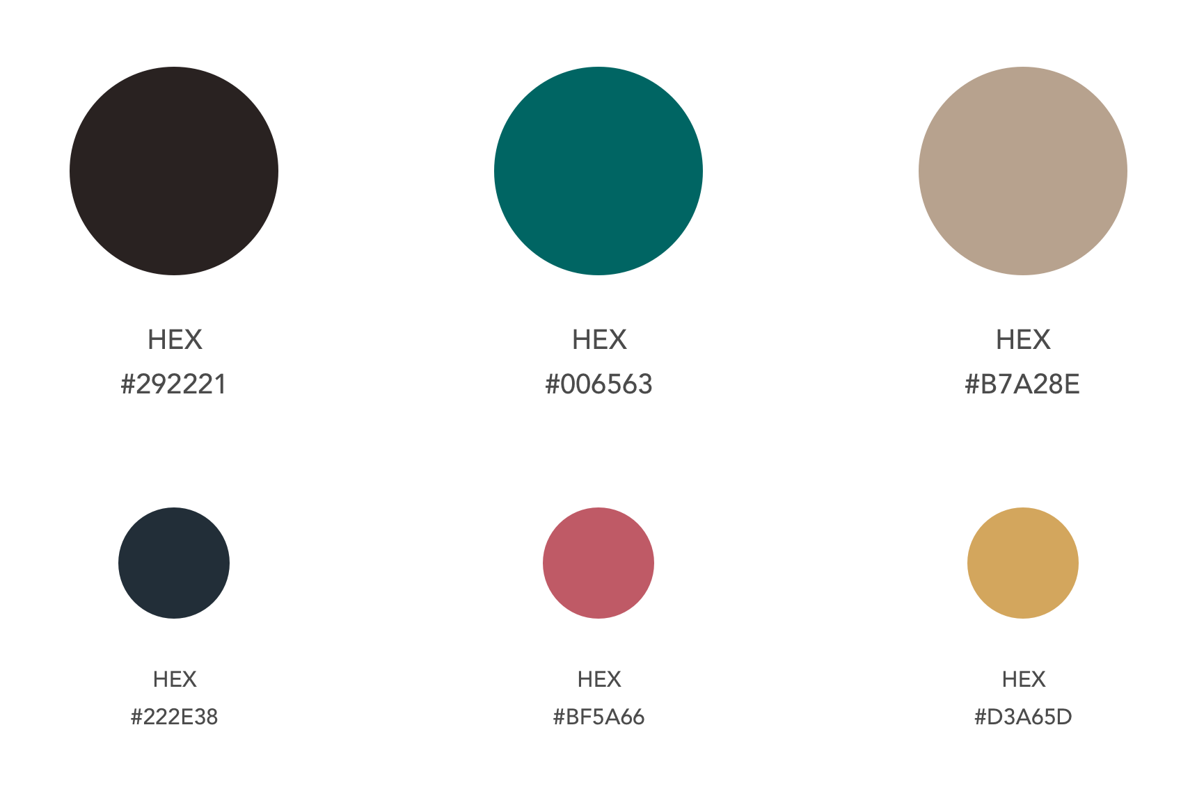
Colour Choices
Utilizing bold and desaturated colours felt like the perfect fit for Third Wave Coffee's branding. The brown tones help with the coffee shop theme and paired with the other colours, it creates a delicate balance. This helps create a unique and memorable brand image for customers. The illustrator helped bring it all together.
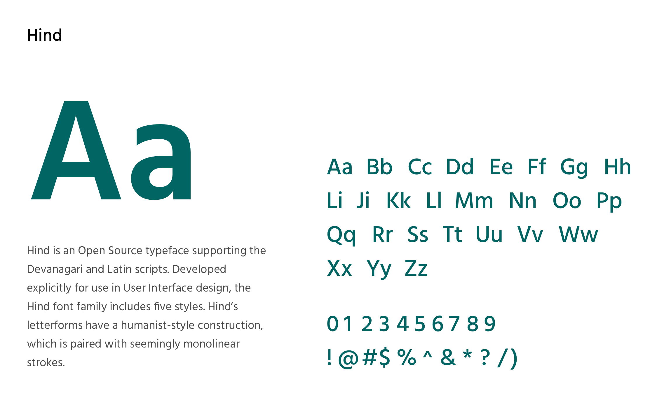
Typography
Because this is an India-based project, we decided to go with Hind for a font choice. Hind is an Open Source typeface that supports the Devanagari and Latin scripts. It pleasantly compliments the colour choices and the overall tone the company is trying to achieve.
Wireframes

Home
Home Screen
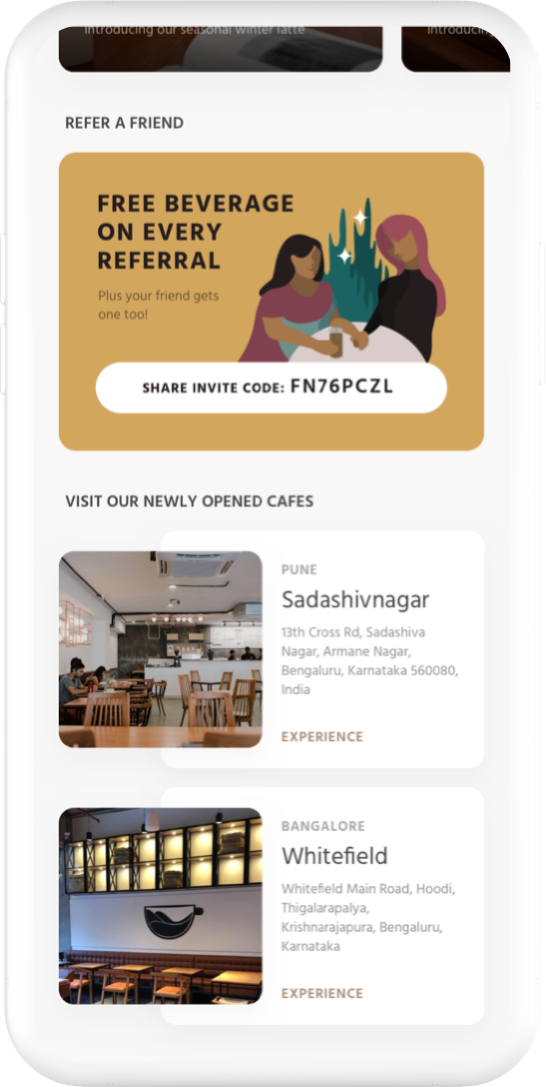
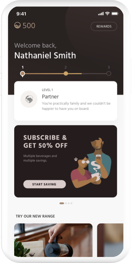
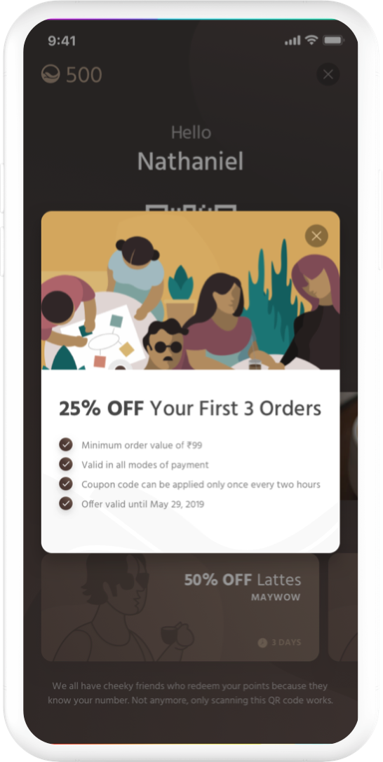
Depending on whether or not this is the first time a user has ever used the app, some elements on the screen won't show up. The user-level at the top of the screen allows for customers to receive more perks, which increases brand loyalty.
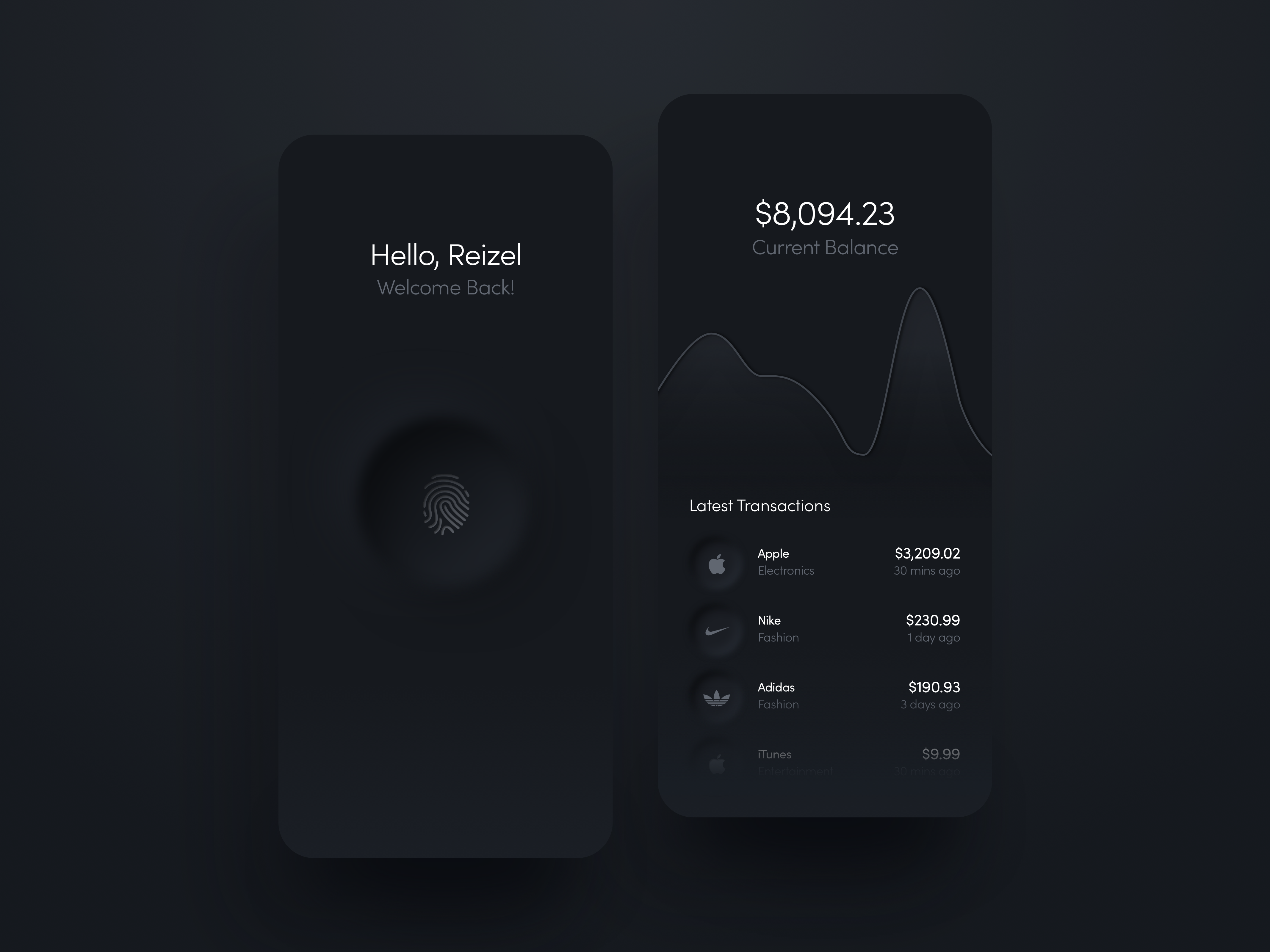
Profile
Home Screen
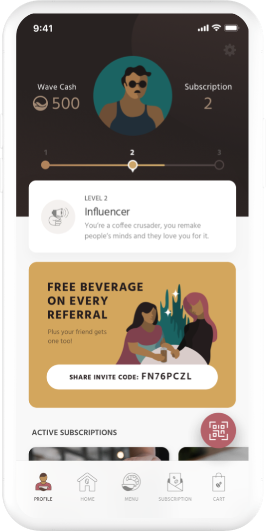
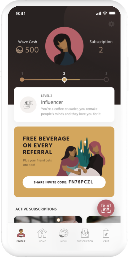
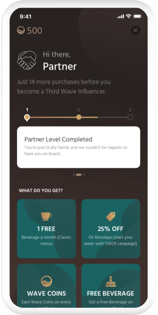
The profile page summarizes everything a customer needs to see about their membership. Here, users can view their current offers, rewards, and Wave Cash amount.
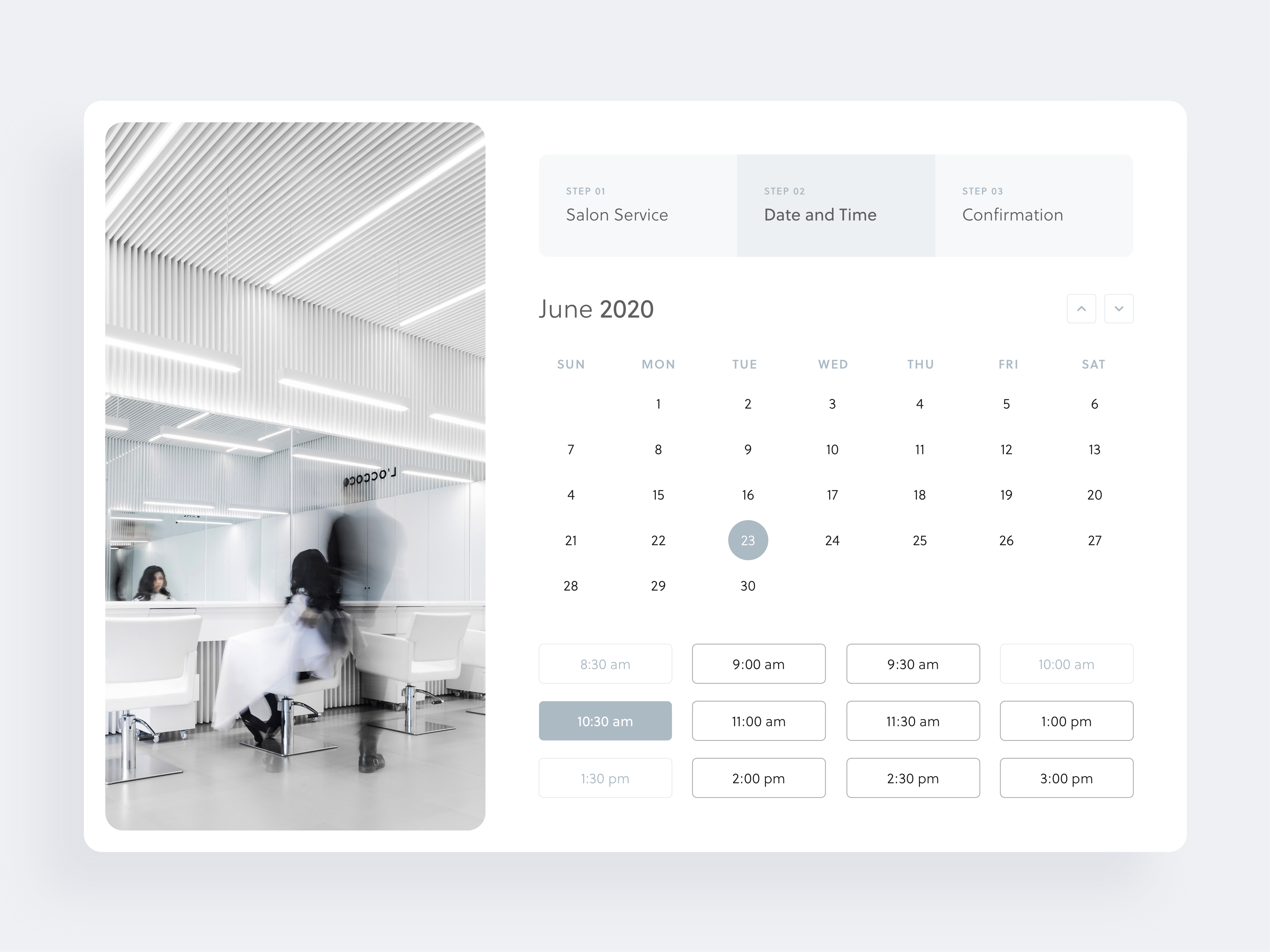
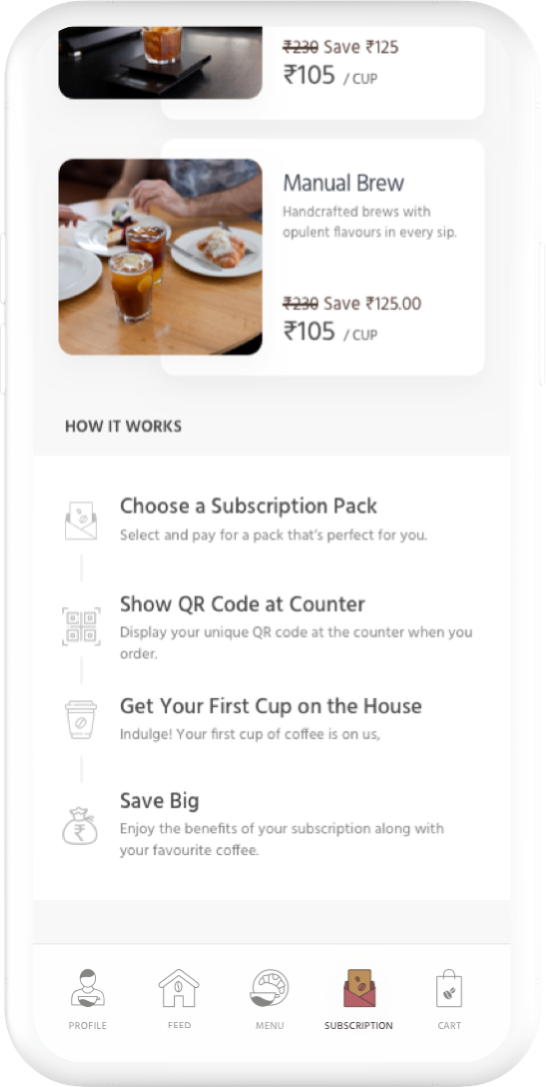
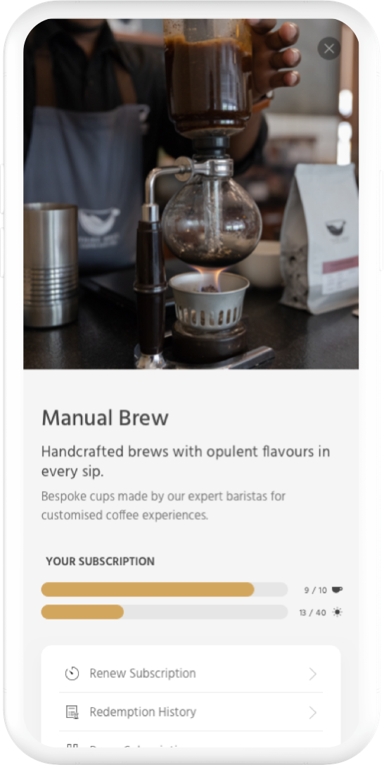
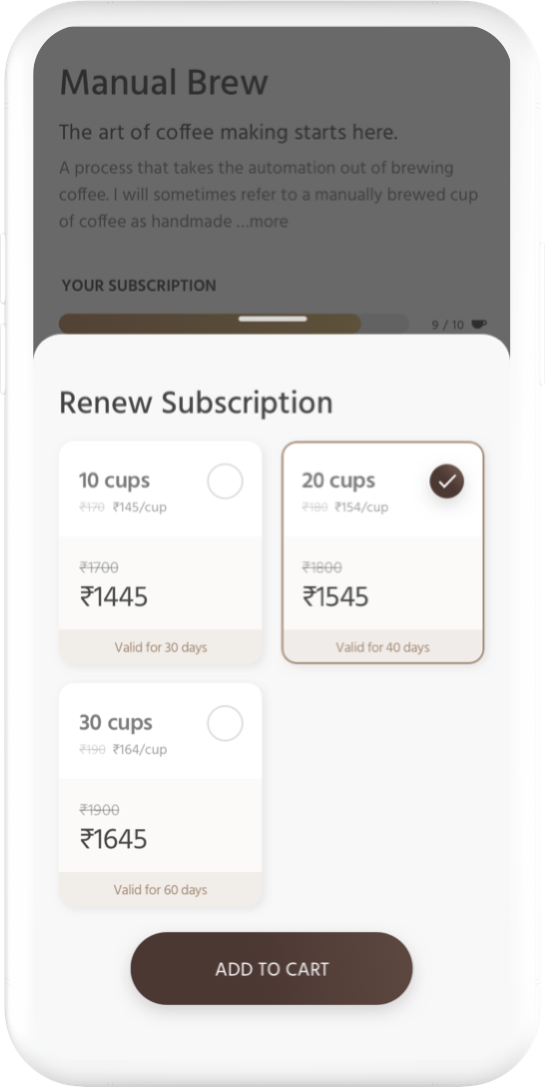
Subscription & Menu
Home Screen
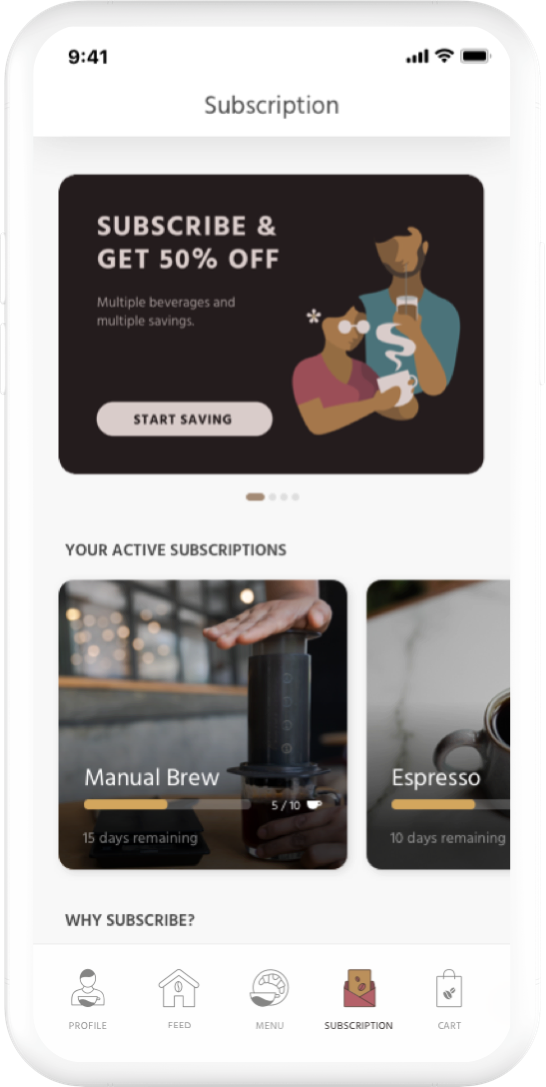
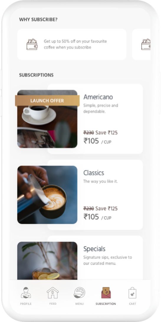
Landing on the subscription screen, I started with promotional banner sliders, customized depending on the customer's activity. The purpose of this screen is to introduce and sell the benefits of subscribing. I've listed down subscription types, reasons to subscribe, and how the subscription works.
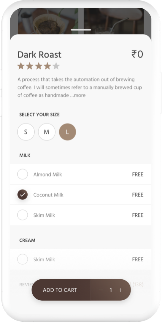
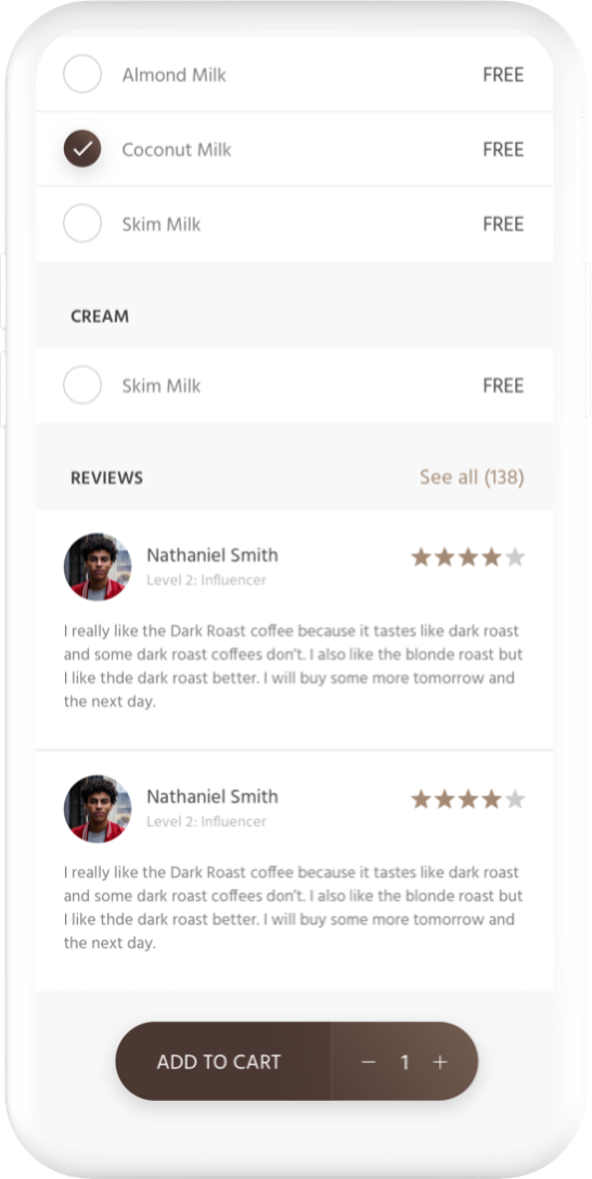
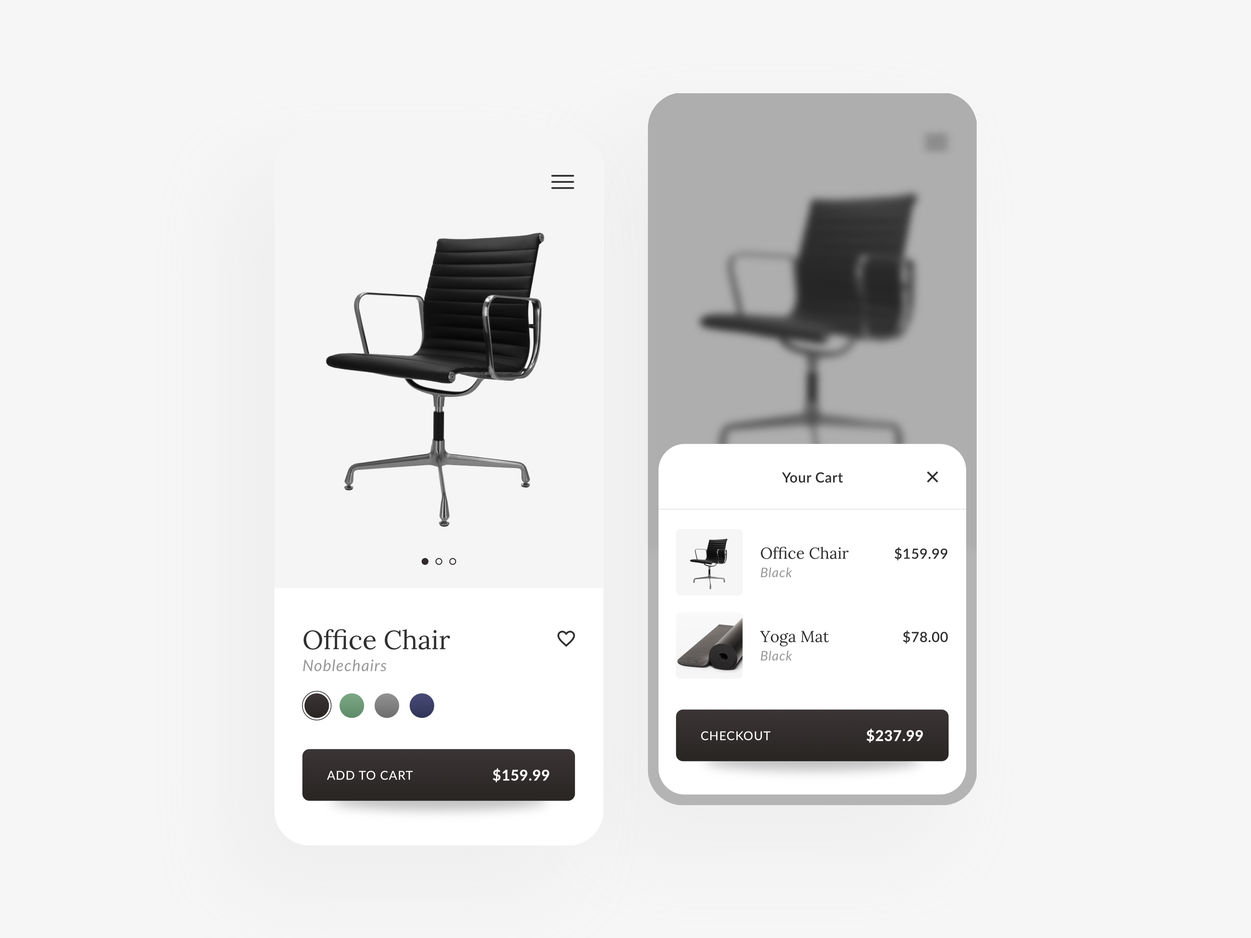
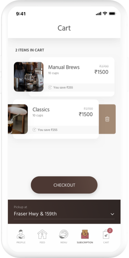
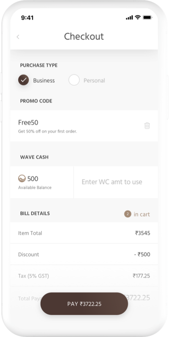
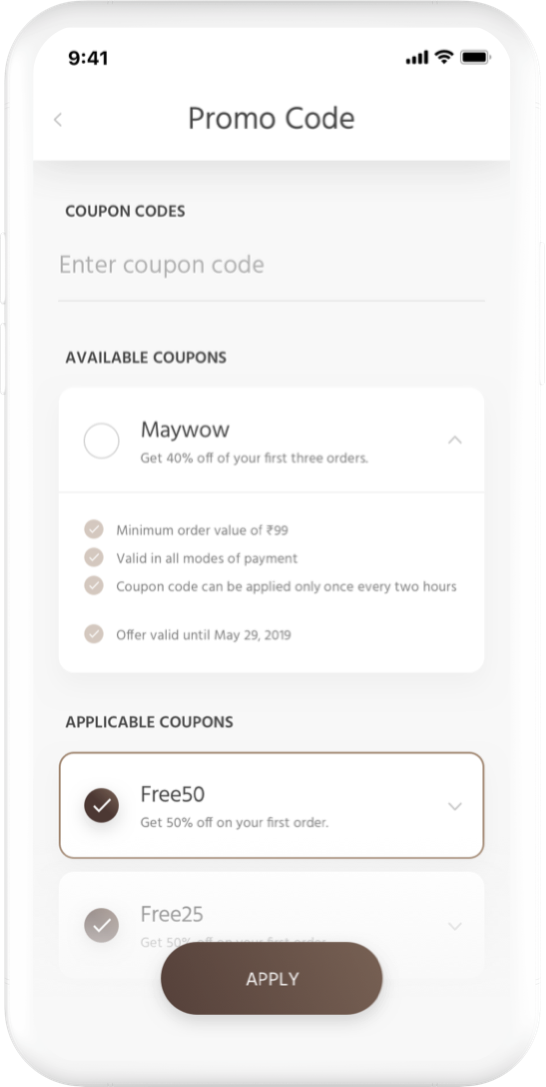
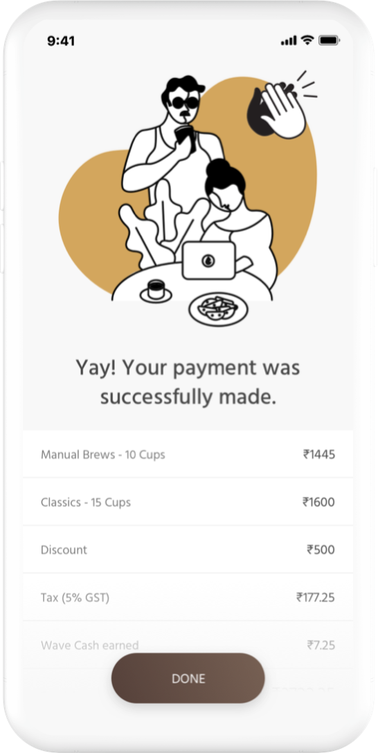
Cart & Checkout
Home Screen
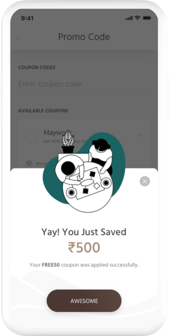
During checkout, customers can decide the amount of Wave Cash to use or save it for another day. Although customers can't pick some of the available coupon codes (some checkout requirements are missing), it is still there to help drive customers to get more bang for their buck.
Final Thoughts
This app is still an ongoing process, and we are continuously making improvements for every new app version. Some key learnings are settling on a tone and style early in the design process to decrease the number of design versions. Other than that, this has been a very delightful project for me, especially since I love coffee!
SOME OF MY WORK ON DRIBBBLE