Datta
Datta is a records management SaaS business solution provider: all business records stored in one place. Though Datta provides record management for several different business categories, in this project, I mainly focused on a fictional medical clinic.
ROLE
Branding, User Experience, User Interface
Side Project
Project Vision
The clinic's primary objective is to accurately organize all of their medical records and make the system usable for anyone, whether a person is familiar with technology or not.
Project Goals
- Learn about the patient's medical background
- Know about the overall statistics of the clinic
- Be able to take a look at how many patients one specific doctor has
- Add medical records quickly
- Easily navigate through the system, without having to train users
Hey there, this is the default text for a new paragraph. Feel free to edit this paragraph by clicking on the yellow edit icon. After you are done just click on the yellow checkmark button on the top right. Have Fun!
Branding
Title
The concept was to give a look and feel that Datta is a modern and trustworthy records management system. The primary goal was to combine all the letters in 'Datta' on the logo.

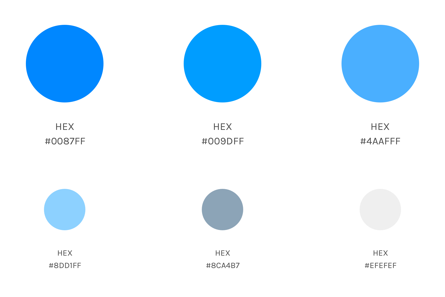
Colours
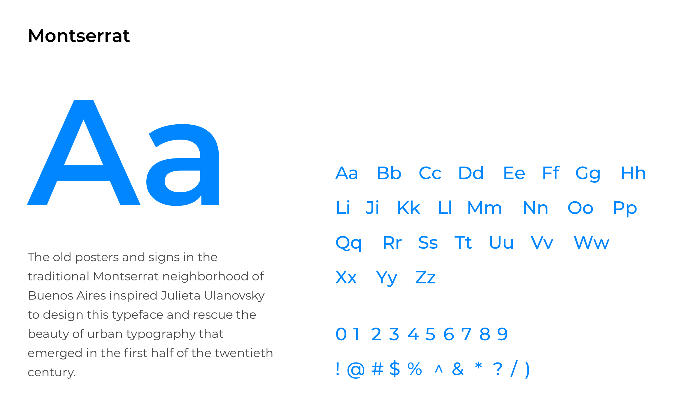
Typography

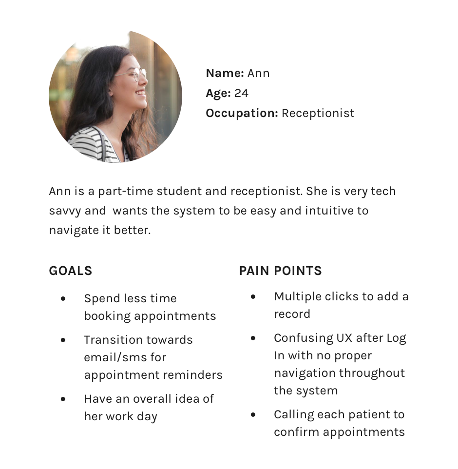
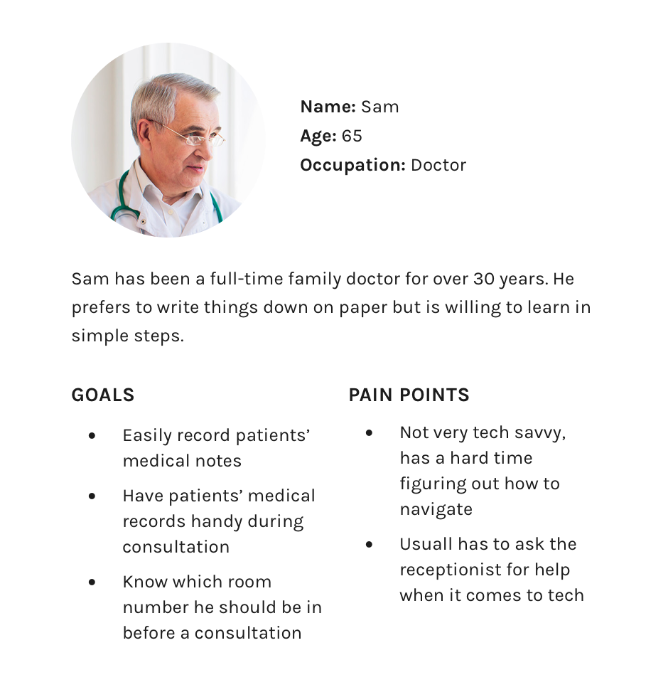
Meet the Users
User Journeys
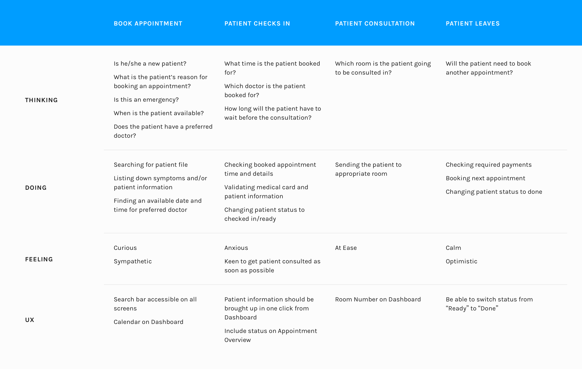
USER JOURNEY FOR ANN
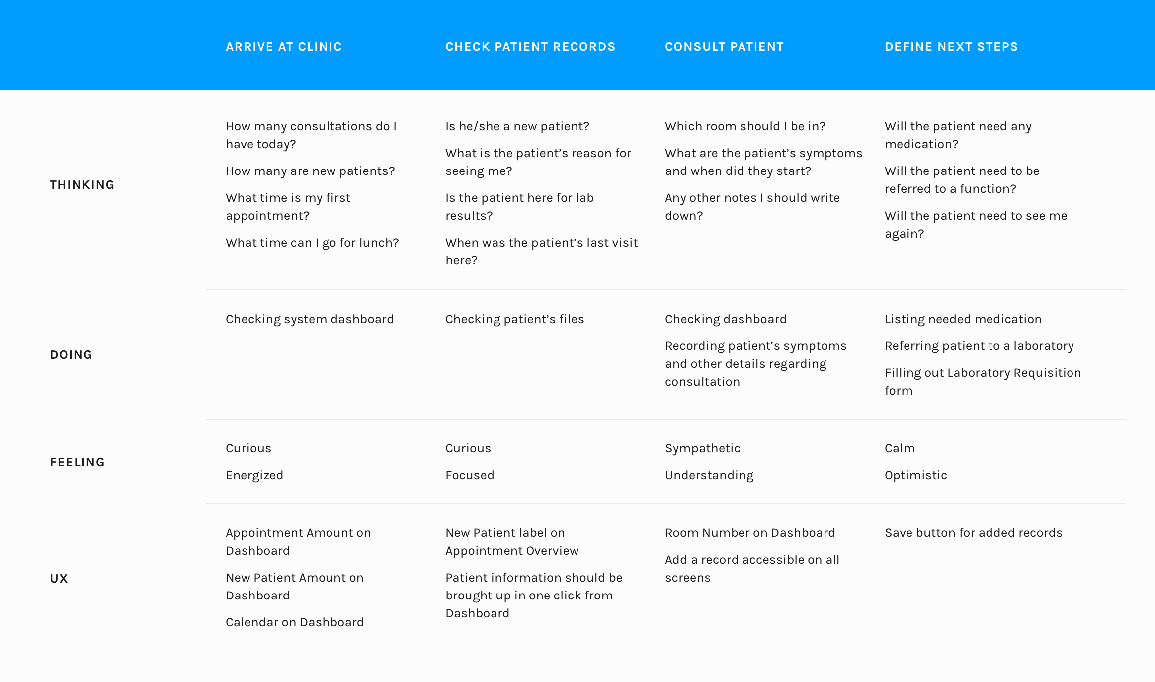
USER JOURNEY FOR SAM
Selected User Flows
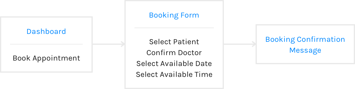
BOOK AN APPOINTMENT
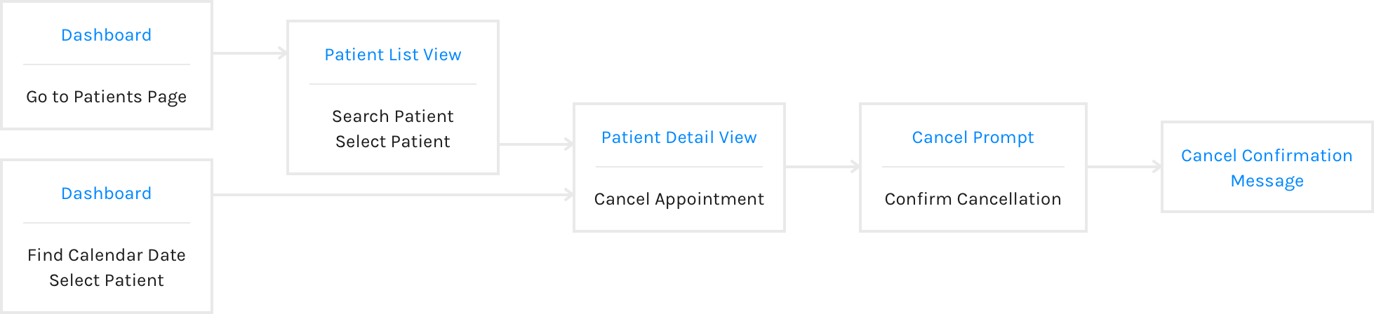
CANCEL A FUTURE APPOINTMENT
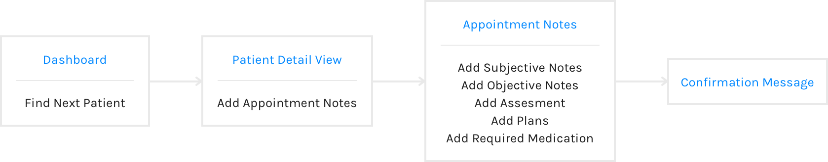
ADD CONSULTATION NOTES
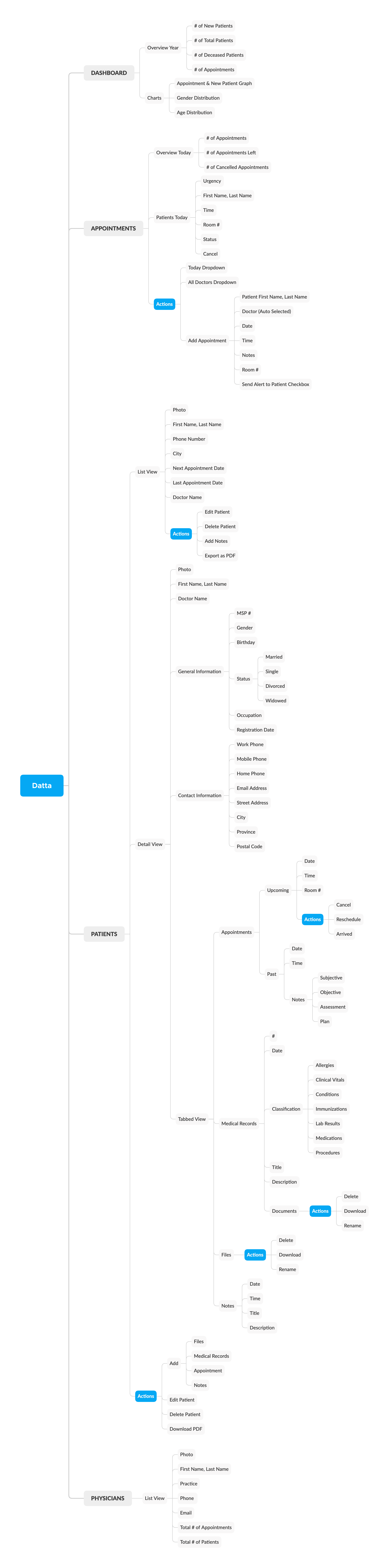
Information Architecture
Wireframes
I opted to sketch my designs on paper instead of high fidelity wireframes. Sketching many concepts helped me form a better understanding of the system earlier, ensuring a more cohesive design. I started with an Apple Pencil and an iPad to draw out my plan. The app's target audience was primarily doctors and receptionists, and the key objective was to set an optimization of records they dealt with regularly.

Dashboard
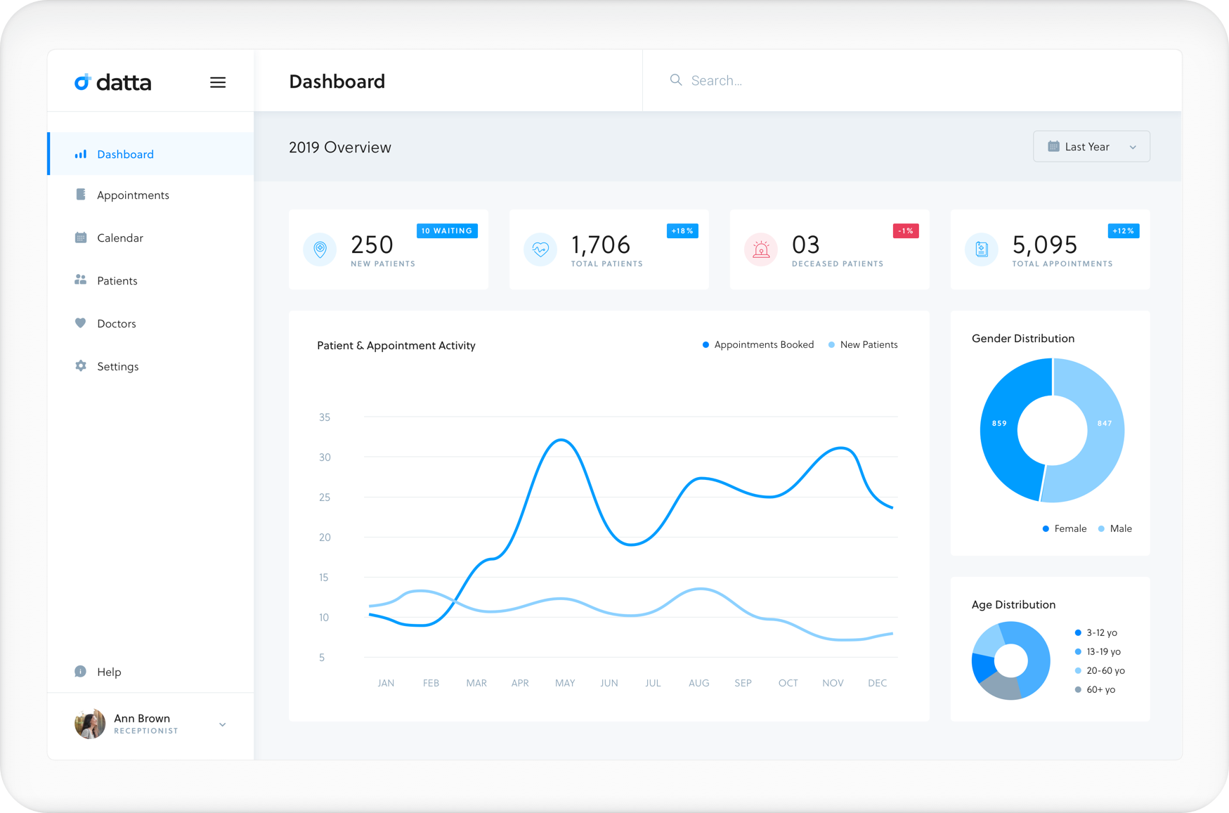
For the landing page, I've decided to go with a yearly overview of the clinic's statistics. The essential features that doctors would especially find useful are the number of new patients, the total number of patients, the number of deceased patients, and the total number of appointments by year. Clicking on the menu icon by the logo closes the sidebar so users can get more use out of the screen.
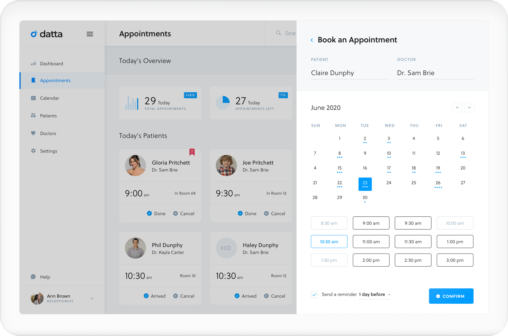
Appointments
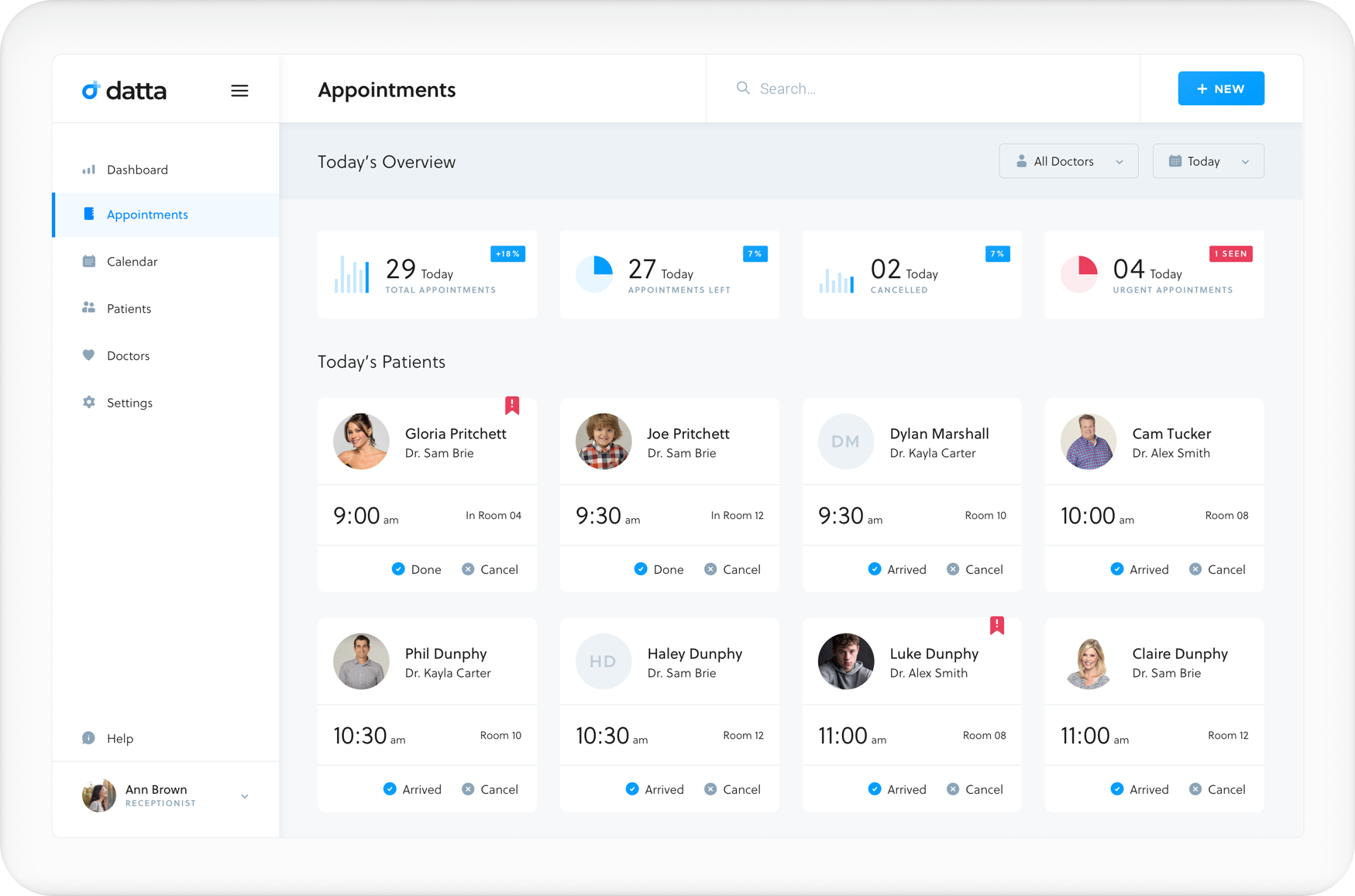
On this page, you can find daily appointment overviews. This information gives an overall idea of what a doctor's day could look like from my research. This page can also be filtered by doctor. As you can see, almost the entire cast of Modern Family will be visiting the clinic (how exciting).
From the Appointment Page, clicking on the New button will show this slider. The patient name is an autofill search function, and the doctor is automatically selected for the specific patient.
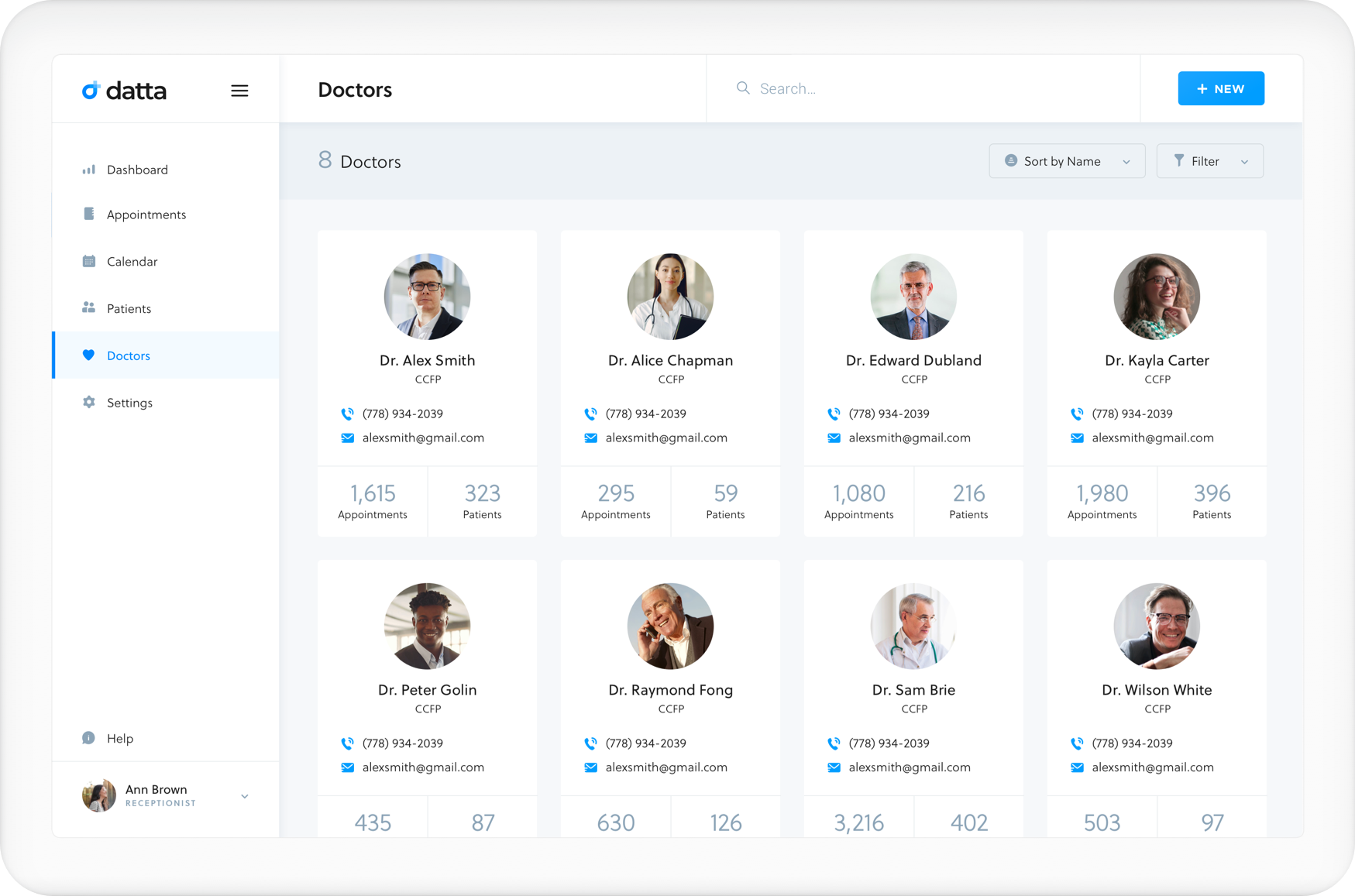
Doctors
A pretty straight forward grid view of the doctors in a clinic. It took me quite a bit of time to figure out whether or not filters and sort are needed for this page. Assuming this clinic will grow (and will probably have more than eight doctors), I've decided to keep them there.
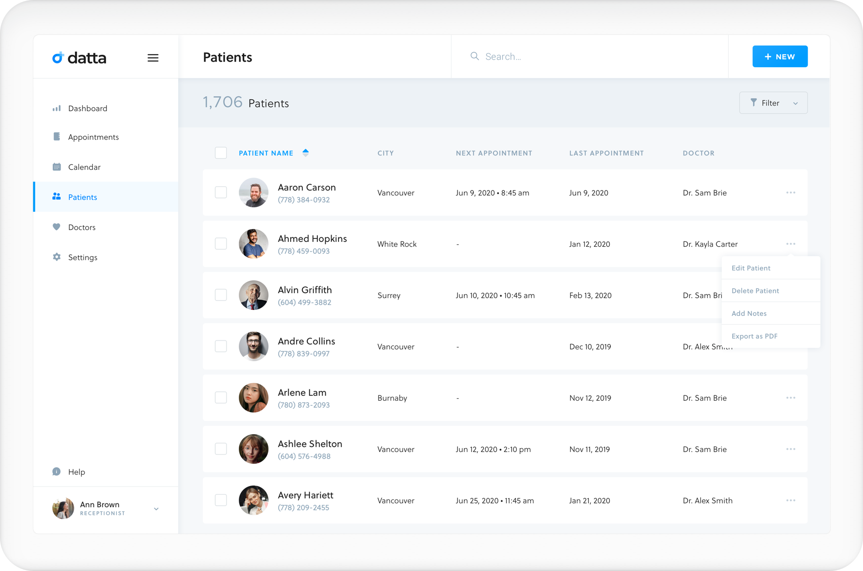
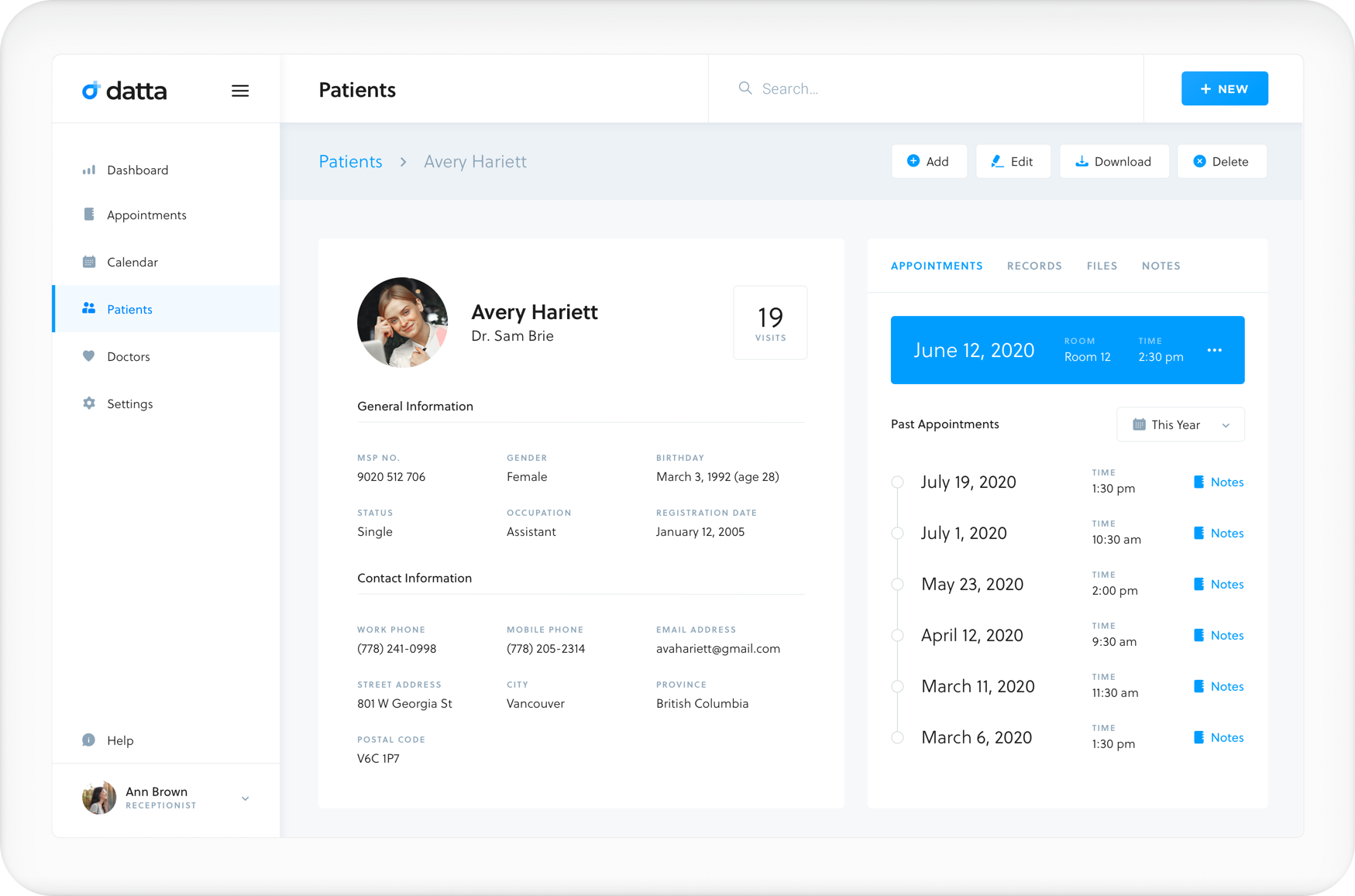
Patients
Because this clinic has a higher number of patients than doctors, I've decided to move away from a grid view for this list to see more information above the fold. Separated into two main sections, patient information on the left and a tabbed view of the patient's history categorized. This was the most challenging part for me to design as I need to show a considerable amount of information while still trying to make it look clean and comfortable on the eyes.
Final Thoughts
Through this case study, I learned the value of the user experience design process. The overall experience has been very challenging but highly rewarding. The branding was especially a fun one for me since I don't typically do much of them. I will likely start to explore the skill some more in the future.
SOME OF MY WORK ON DRIBBBLE