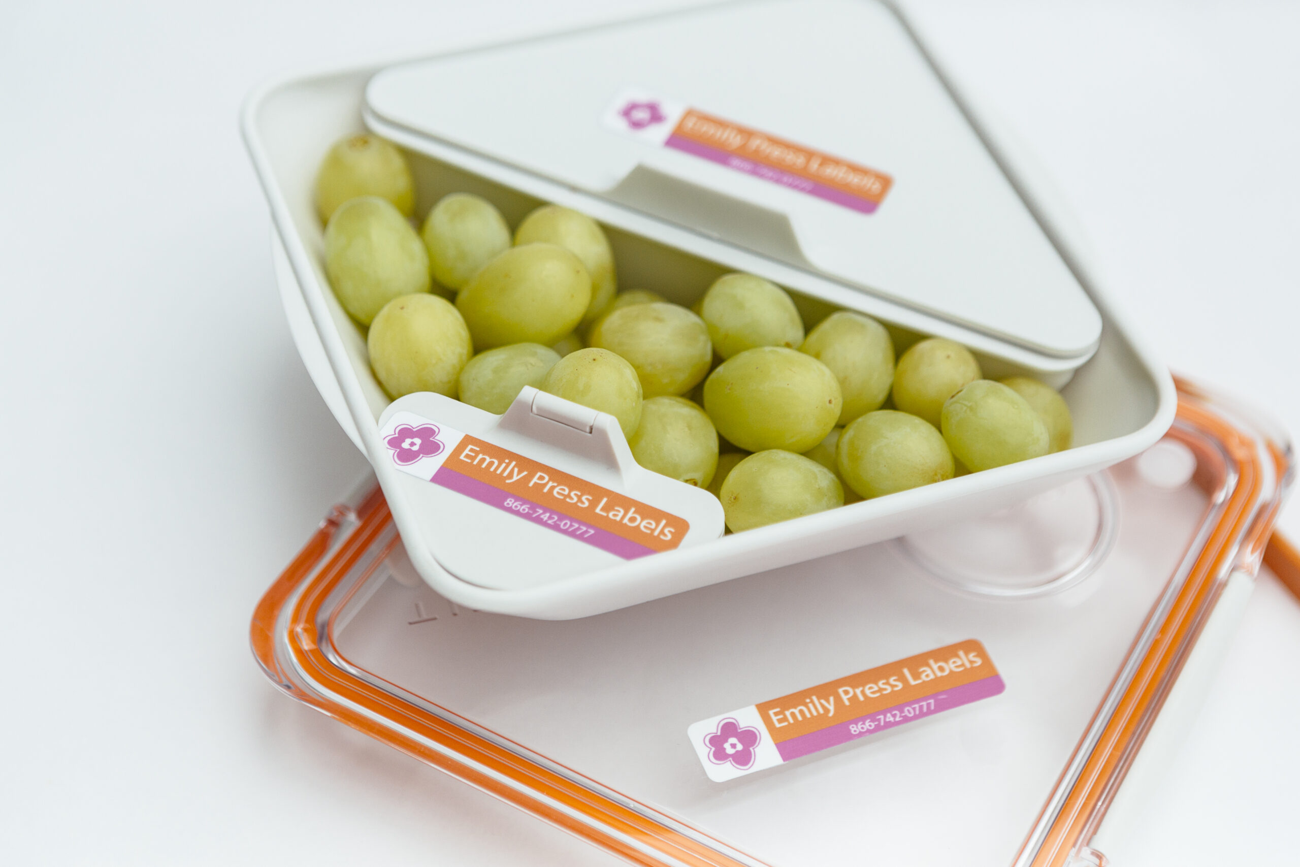
Emily Press Labels
Emily Press has award-winning labels, eco-friendly label options, recognition from top parenting websites, and labels that parents AND kids love.
ROLE
Mockups, Front-End Development
ideaLEVER Client
Problem
Emily Press needed a visual refresh, greater flexibility for their content, and a responsive modern website with a fun feel that closely reflects the company's style.
Approach
The biggest challenge going into this project was the broad scope, so I had to be resourceful with where my time was focused. This gave me the opportunity to design, build, and hand off the client manageable eCommerce site from the ground up within the client's budget.
Hey there, this is the default text for a new paragraph. Feel free to edit this paragraph by clicking on the yellow edit icon. After you are done just click on the yellow checkmark button on the top right. Have Fun!
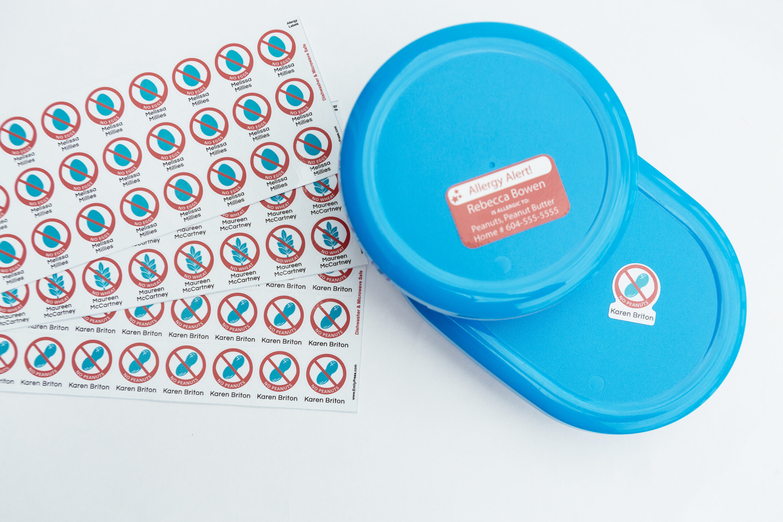
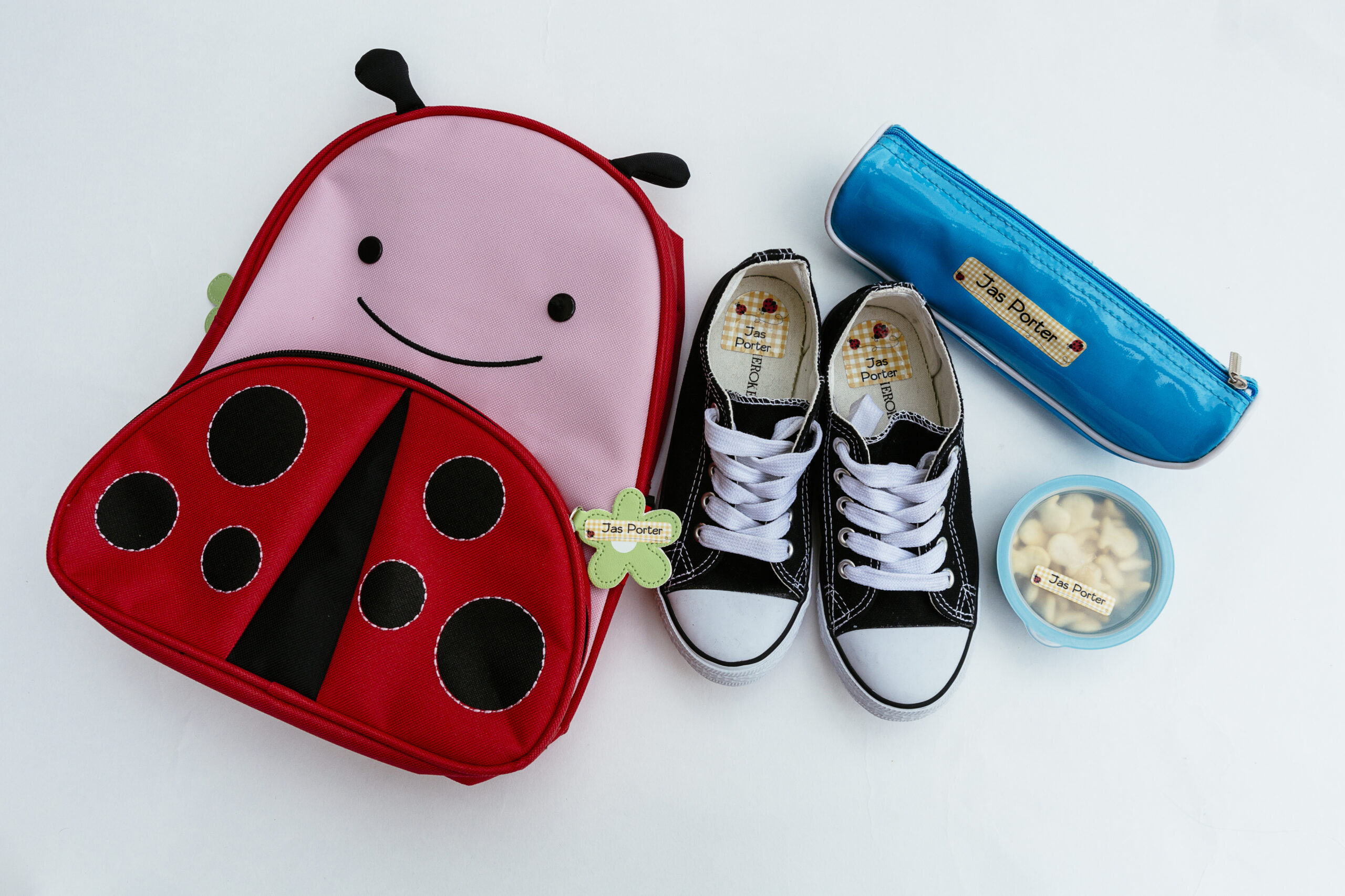
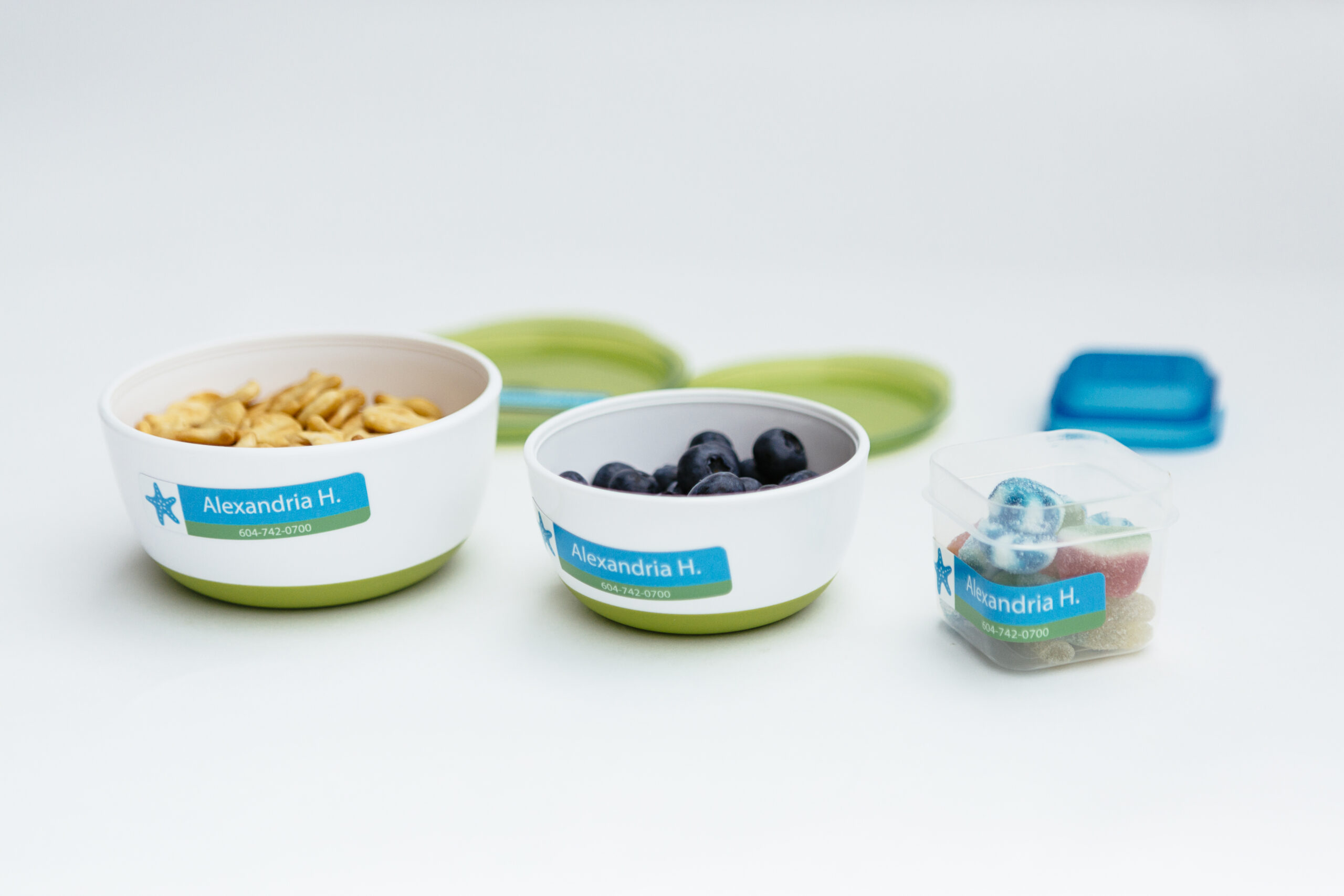
Stick with Style™
"With the goal to create looks that kids, youths and savvy grownups would love, the designing and sketching of the first unique designs took shape.
The stickiest of adhesives was sourced for the labels so they would stand up to the toughest of tests - KIDS! Then the waterproof labels were finished with a coating that prevents your custom text from wearing off."
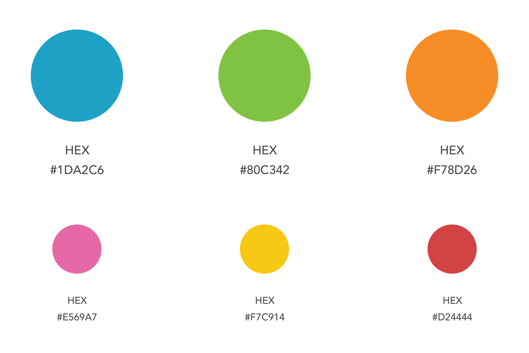
Colour Choices
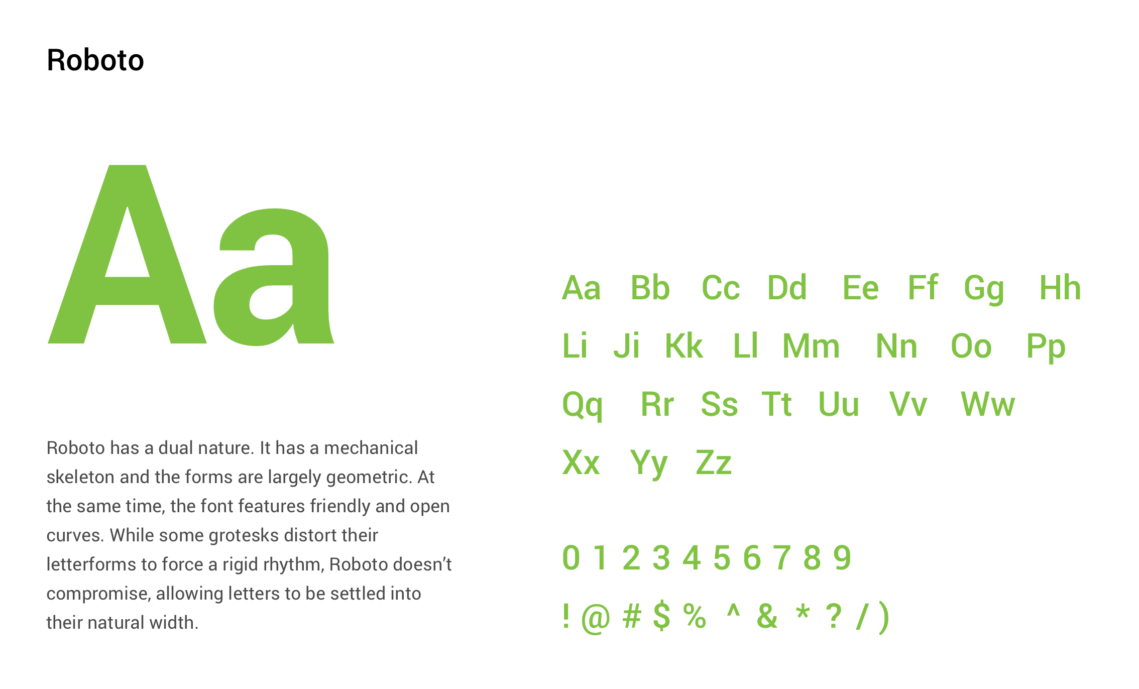
Typography
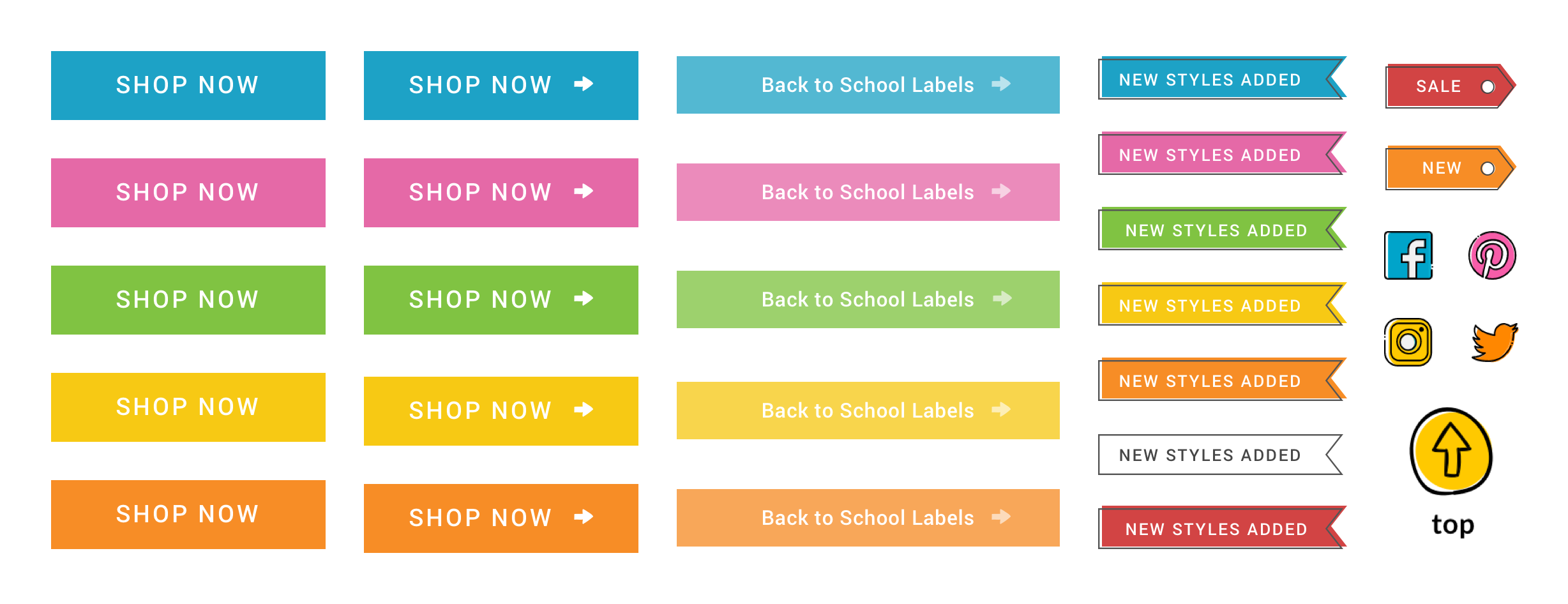
Site Elements
Site Preview
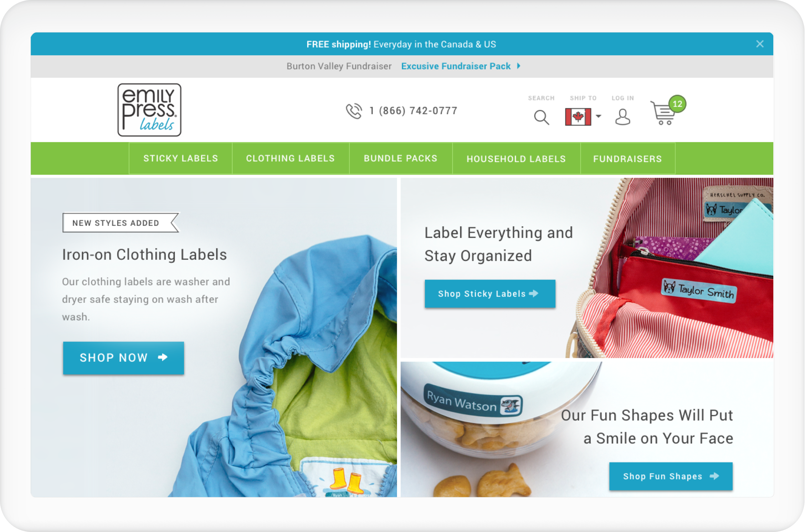
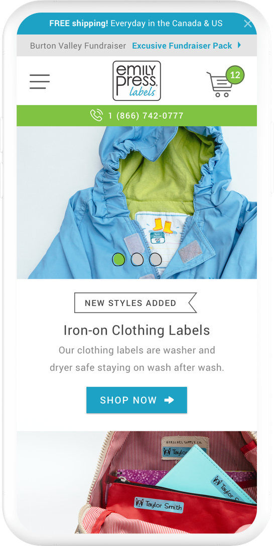
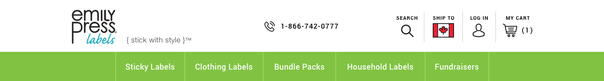
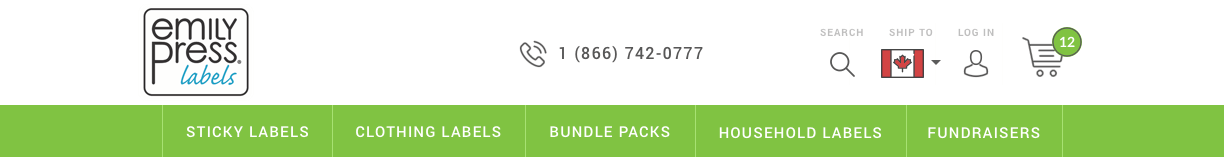
Header
I went through multiple versions of header designs until both the client and I were happy with how it looked. One of the main things we wanted to achieve was for the logo to stand out from the rest of the content in the header. In the first version, the line icons were thicker, competing with the logo. The switch to Version 2 with the thinner line icons solved this problem.

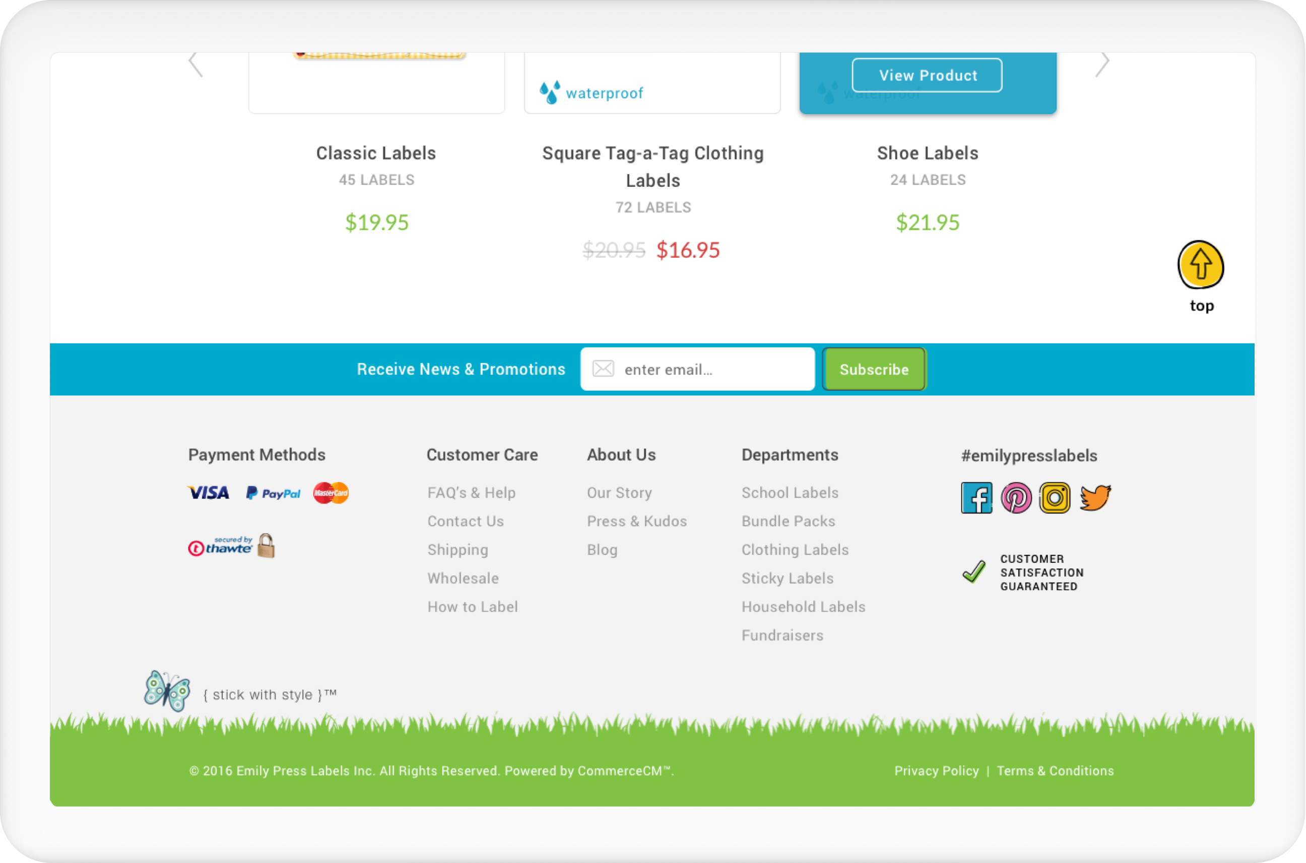
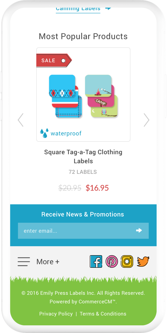
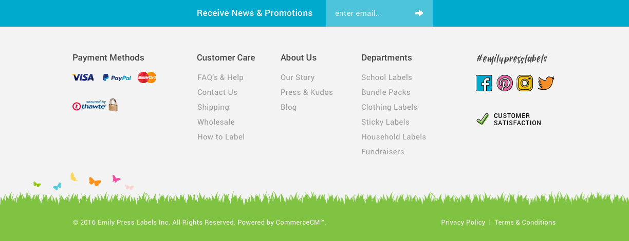
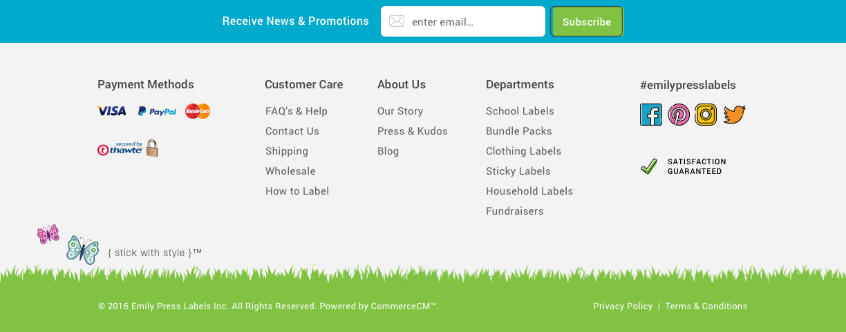
Footer
Out of all the sections of the mockups, the footer was the most fun part of the design. It took quite a while for me to figure out how I can pleasingly put together all the content needed without it looking too busy and boring. I went for the grass background and colourful social media icons to give the footer a nice pop.
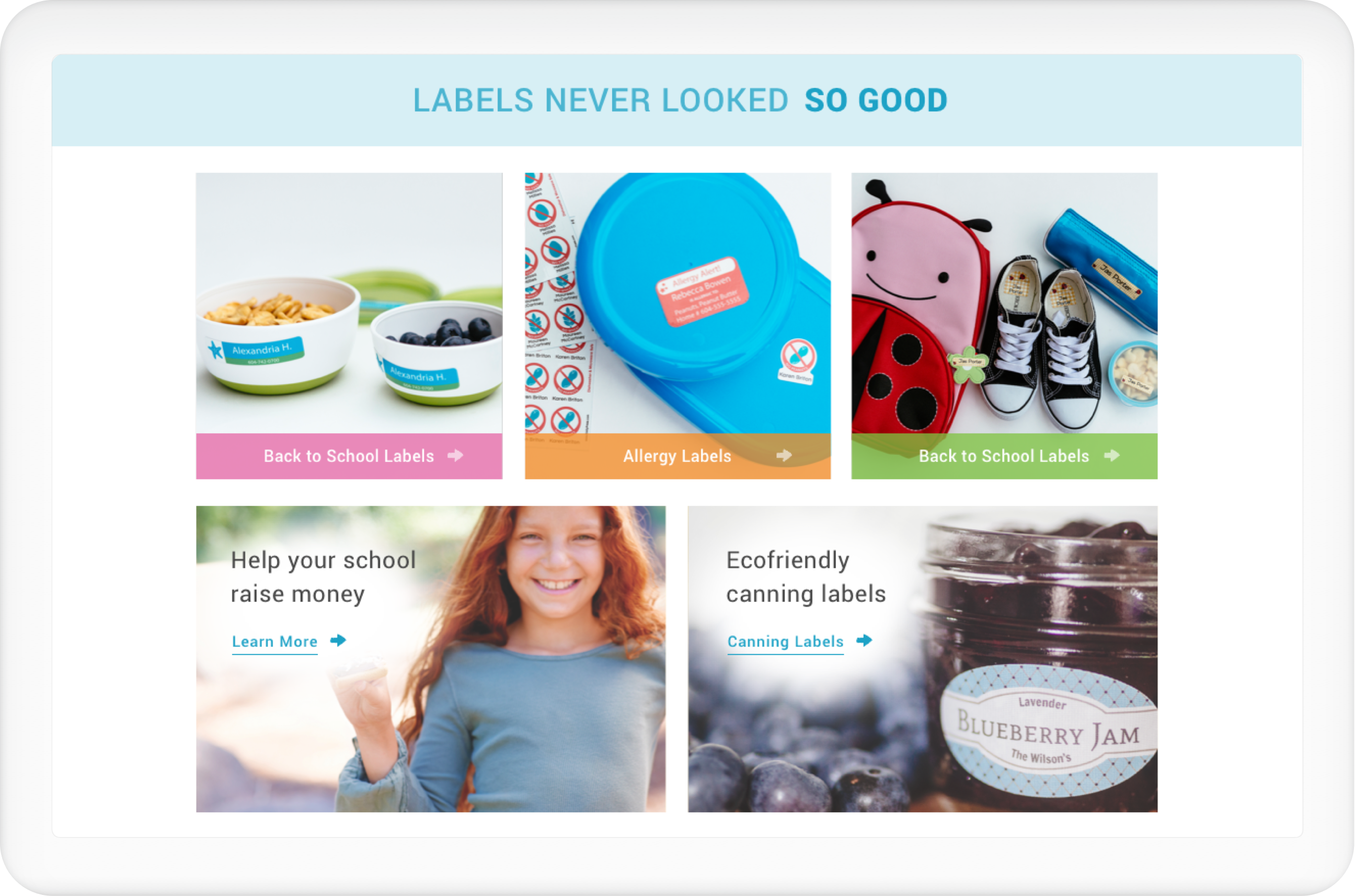
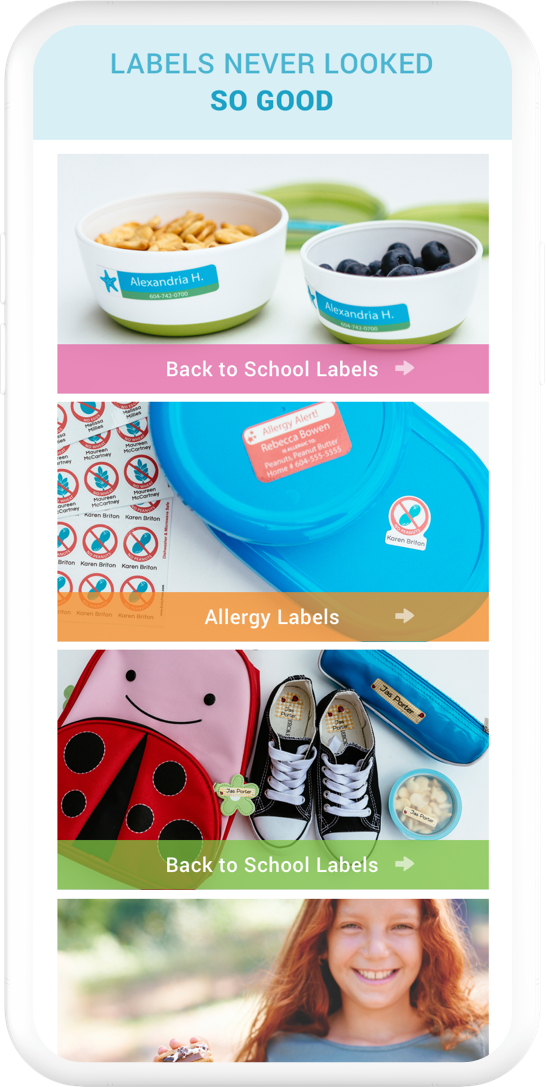
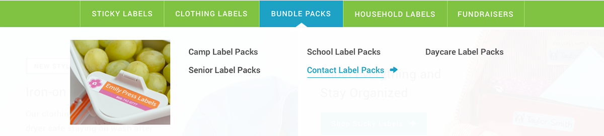
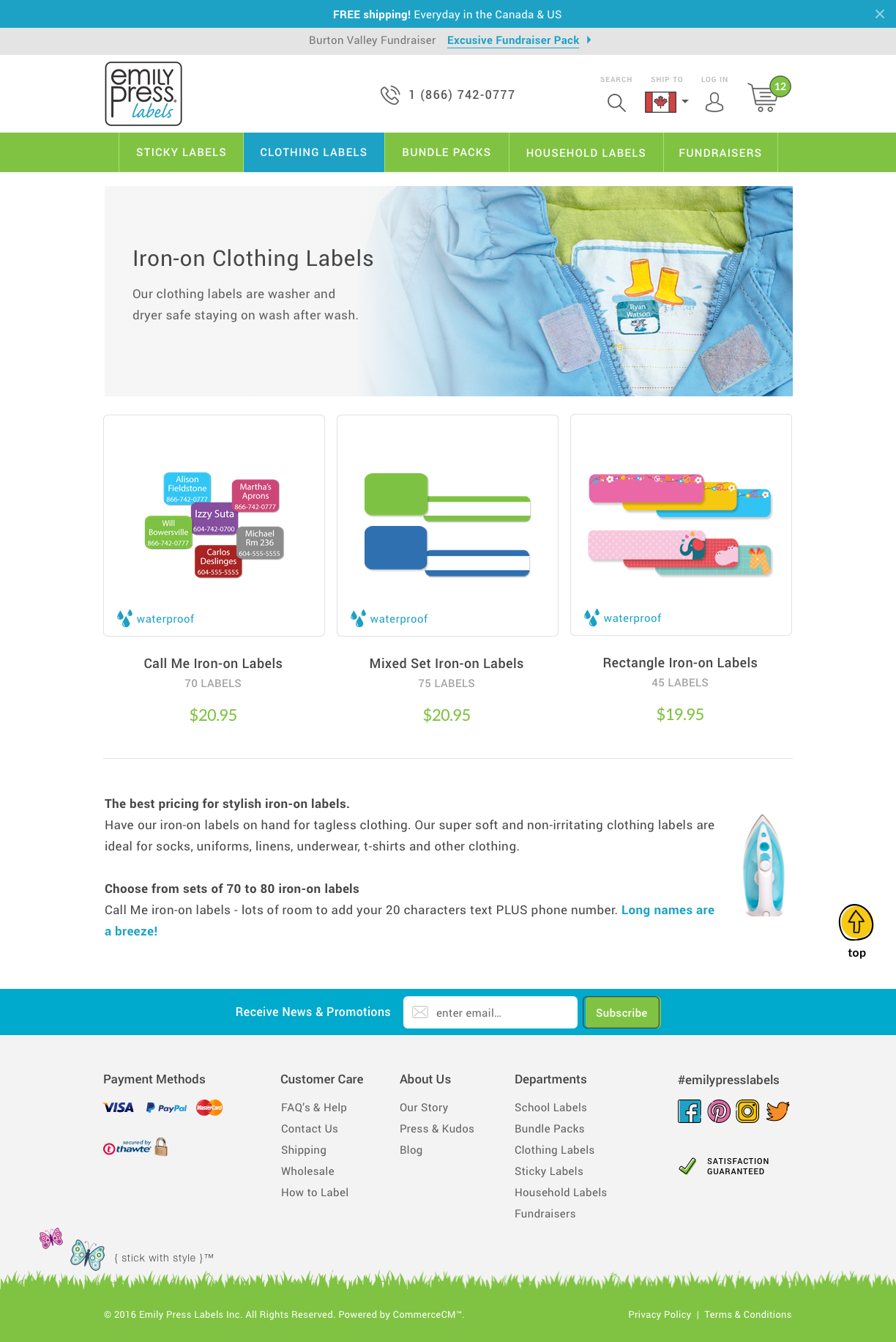
Department
Because it was a challenge for customers to differentiate the labels just by quickly glancing at the product images, we had to find a way to describe each label category.
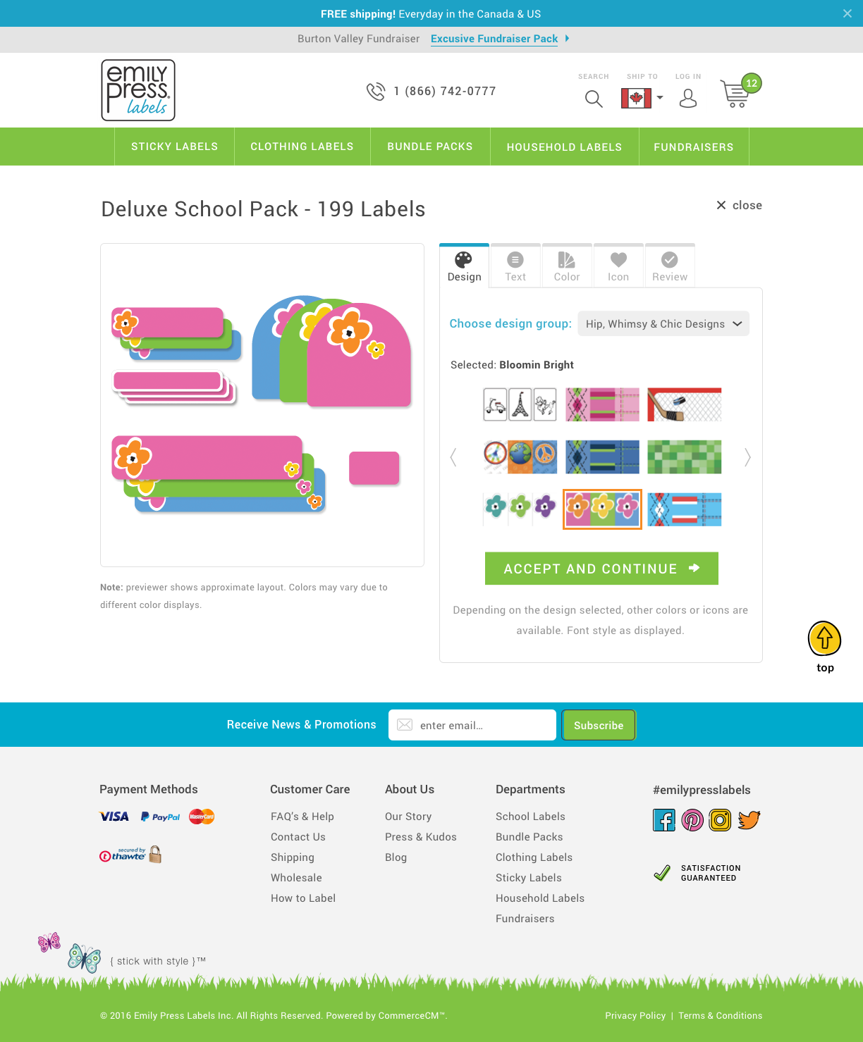
Label Maker
Product
There is quite a bit of information needed for a lot of the labels. This got me thinking, how can I show all of them without scrolling too much down the page? I decided to go with the tabbed view for a better overall idea of what each user can learn about the product.
Front-End Development
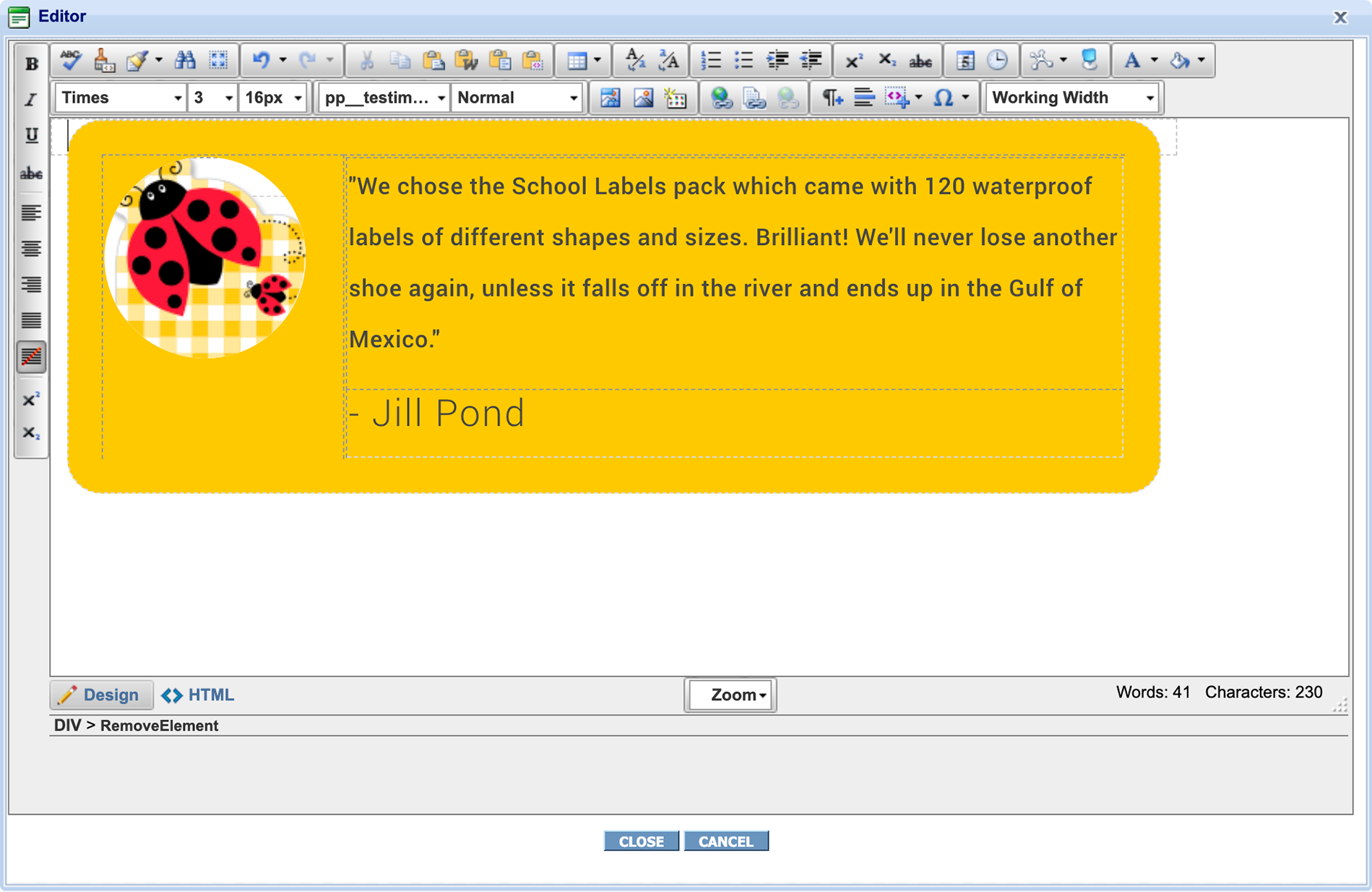
Since this is a client manageable site, I had to make sure that the code works with the client's ability to visually edit the content. It was especially challenging to find a way for each element to make sure that there's no chance for the client to accidentally 'break' the design while making changes.
With CommerceCM (the CMS ideaLEVER uses), it gets quite tricky since the only way the developers have found (so far) to avoid this is by wrapping each class in a table. It's still currently an ongoing process that the developers are trying to improve.
Key Learnings
SEEK FEEDBACK EARLY AND OFTEN
Despite the close collaboration between the client and me, there could have been more conversations early on in the project. This resulted in many different versions of just the Home Page to get the most appealing design style.
SOME OF MY WORK ON DRIBBBLE